Rollout Context
How consistent food and venue imagery supported booking confidence
Io e Te did not need more random content. It needed a tighter visual system.
Before the refresh, the restaurant’s online presentation was not matching the standard of the in-person experience. The food was strong, but the brand did not look equally resolved across the website, menu design, and social media.
Jojo approached the brief as commercial problem-solving, not just a content day. The goal was to create a set of assets that could hold up anywhere a customer might encounter the restaurant before deciding to visit, order, or book.
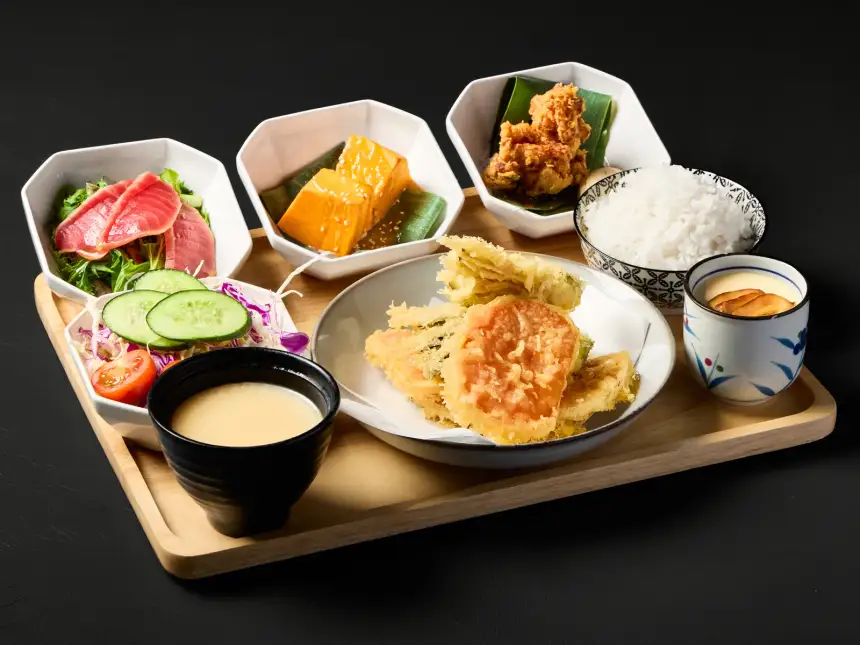
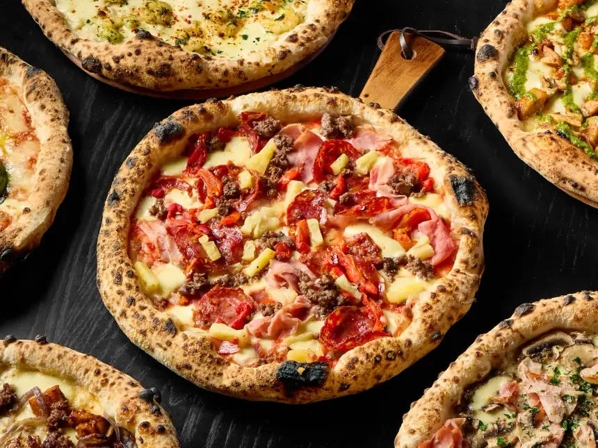
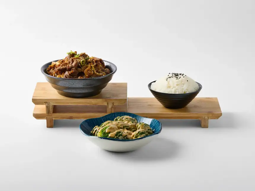
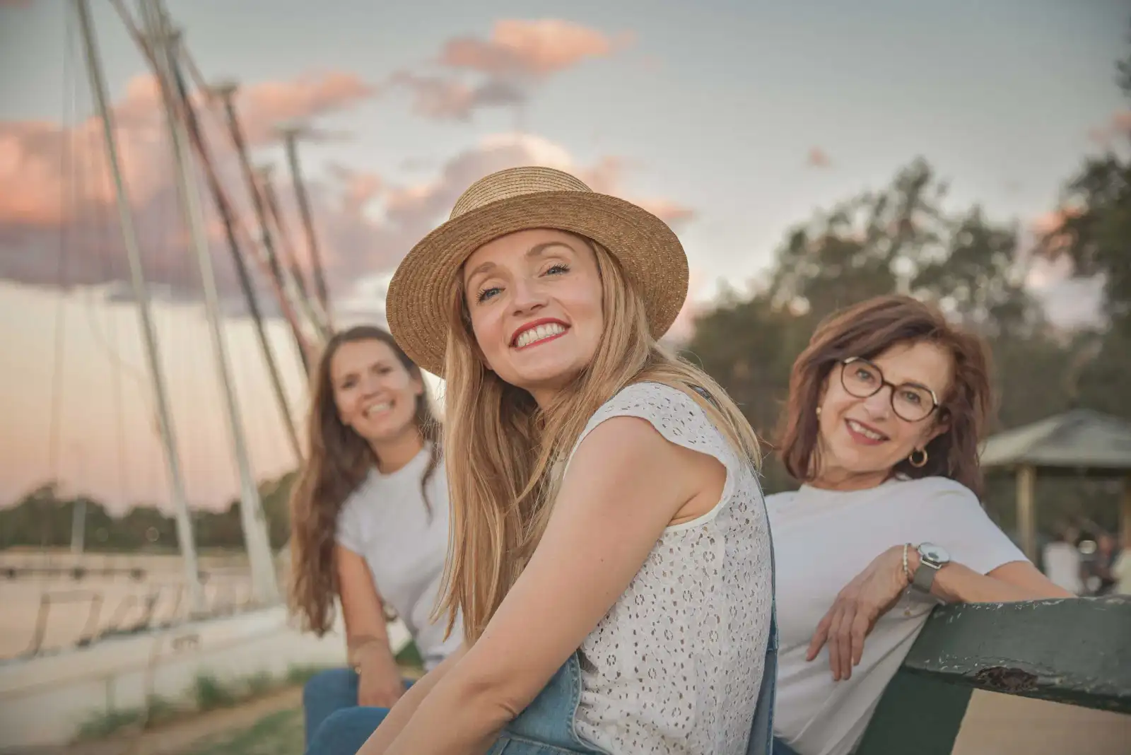
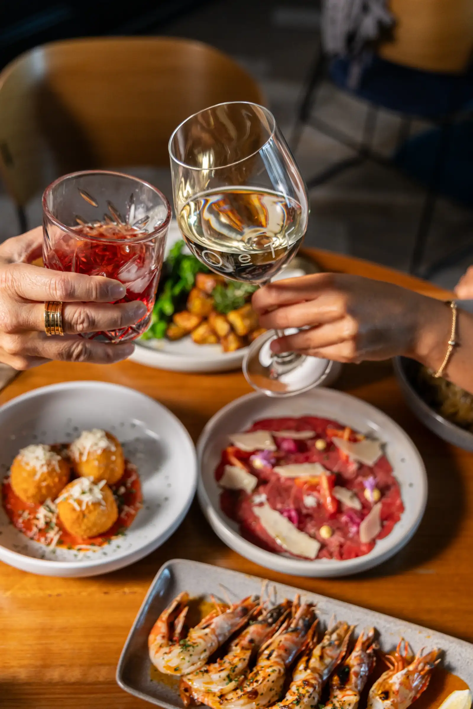
That required more range than a collection of plated dishes. Pizza, ravioli, steak, dessert, cocktails, shared-table moments, and the restaurant frontage each answer a different customer question. Together they show the food, the occasion, and the venue, while consistent colour and editing keep the website, printed menu, and social feed recognisably part of the same Italian restaurant brand.
Once the new imagery started being used across the business, Io e Te had a more coherent visual presence. That translated into stronger social traction, clearer day-to-day promotion, and better booking confidence because the restaurant finally looked as considered online as it felt in person. The project reflects our wider approach to restaurant food photography in Perth: build for all the places a diner encounters the venue, not a single post.