Rollout Context
Why Omasa's menu library works like ecommerce product imagery
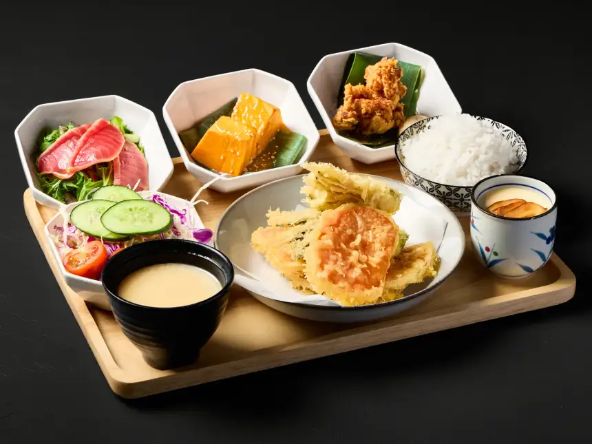
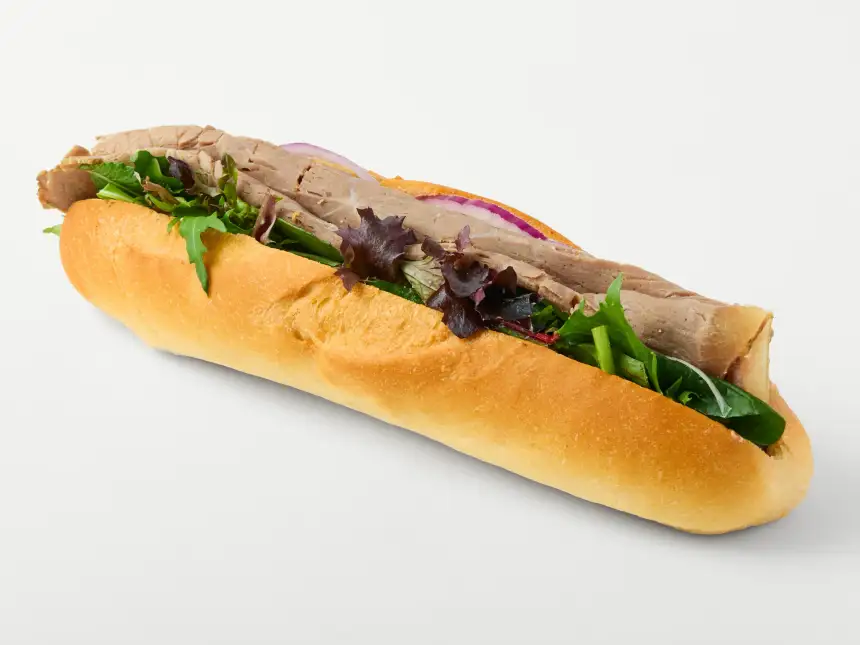
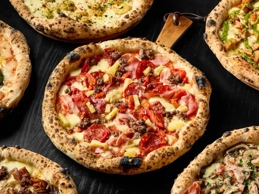
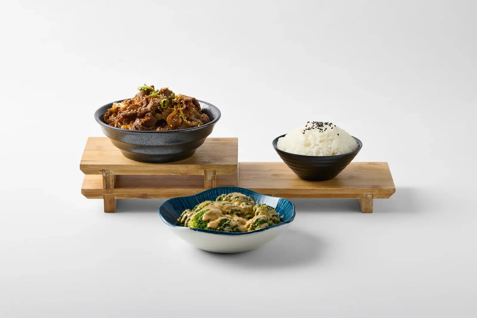
Omasa’s brief was practical from the start: build a menu image library that helps customers understand the food quickly. Rather than leaning on moody restaurant ambience, the shoot focused on clean white-background presentation so each dish could read clearly on screens, printed menus, and ordering pages.
That matters more when a restaurant carries a broad mix of sushi, gyoza, donburi, and sides. If every image is framed or lit differently, the menu starts to feel improvised. Standardised photography solves that by making the whole set feel like one system while still keeping texture, colour, and portion cues visible.
Repeatable camera positions and restrained props also make the files easier to crop for different platforms. A customer can compare dish size, ingredients, and presentation without atmospheric styling competing for attention, while the restaurant can place the same library into online ordering cards, website grids, printed layouts, and social posts. In that sense, white-background menu photography performs much like ecommerce product photography for food.
The resulting Omasa library works more like ecommerce-style food imagery than a one-off editorial gallery. Each file can be reused across the website, menu updates, online ordering, and social crops without needing a different visual treatment every time. That is the value of menu photography built for real commercial use, and it is a practical option within our Perth food photography service.