The Challenge: A Popular Restaurant Losing Bookings to Its Own Menu
A well-reviewed Northbridge restaurant approached us with a frustrating problem: despite excellent food, great reviews, and a prime location near William Street, they were seeing fewer online bookings than competitors with similar ratings. Their Google Business Profile was optimised, their social media was active, and their staff was friendly—so what was going wrong?
The culprit was hiding in plain sight: their PDF menu.
Like many Perth hospitality venues, this restaurant had created their menu as a PDF years ago and simply uploaded it to their website. It seemed convenient at the time—one file to update, easy to print. But as mobile traffic grew to dominate their website visits, the PDF became a conversion killer.
The Problems We Identified
Our initial audit revealed four critical issues with the existing menu:
- Slow loading times: The PDF took 8–12 seconds to load on mobile data, causing 40% of visitors to abandon the page before seeing the menu.
- Poor mobile usability: Diners had to pinch-zoom repeatedly to read dish descriptions, with text rendering at 8pt—impossible to read without zooming on any smartphone.
- Zero SEO value: Google couldn’t index individual dishes, so the restaurant missed out on searches like “gluten-free pasta Perth” or “vegan options Northbridge” or “wagyu steak William Street.”
- Unappetising visuals: The PDF contained low-quality smartphone photos that didn’t do justice to the chef’s creations—and in some cases, actively deterred ordering.
The restaurant’s own analytics told the story clearly: mobile users accounted for 78% of menu page visits, yet the bounce rate on that page was 62%. Compared to their homepage bounce rate of 34%, the menu was clearly a bottleneck turning hungry browsers away before they could book.
The maths were stark: If just 10% of those bouncing visitors had stayed and booked, it would mean an additional 25+ bookings per month—worth over $3,000 in revenue.
The Solution: A Mobile-First, Visual-Driven Redesign
We partnered with the restaurant to create a completely new digital menu built with modern web standards. The goal was simple: make it fast, beautiful, and effortless to use on any device. The redesign included three core components:
- Responsive HTML menu: We replaced the PDF with semantic HTML that automatically adapts to screen size, eliminating pinch-zooming and downloads entirely. Text renders at readable sizes on every device.
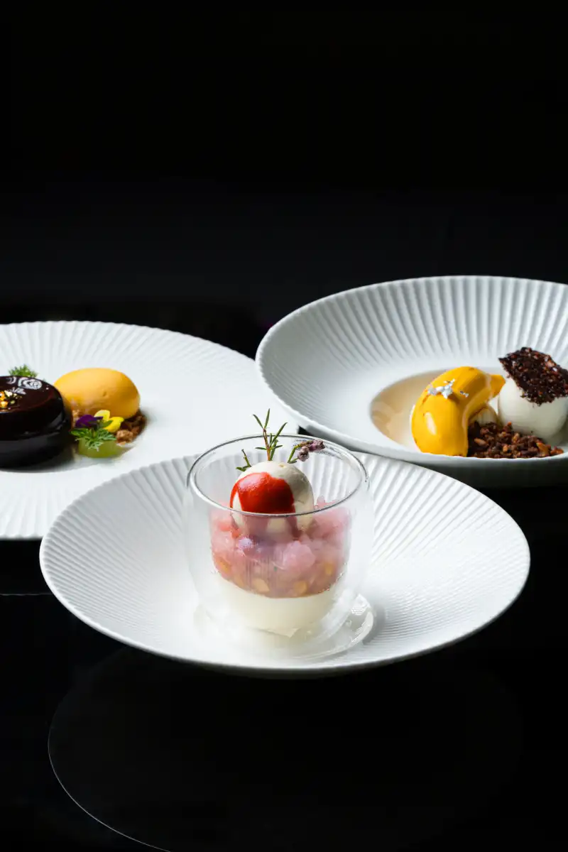
- Professional food photography: We conducted a half-day shoot to capture 15 signature dishes in a style that matched their brand—bright, fresh, and inviting, with consistent styling across all images.
- Performance optimization: Images were compressed using modern codecs (WebP/AVIF), lazy-loaded for faster initial page loads, and served via a global CDN to ensure sub-second loading even on slow 4G connections.
The new menu was integrated directly into the restaurant’s existing website, with clear sections (Starters, Mains, Desserts, Drinks) and intuitive navigation. Each dish could be expanded to show detailed descriptions, dietary tags (GF, VG, VGN, DF), allergen information, and high-resolution photos.
The Redesign Process: Step by Step
Here’s exactly how we approached the project, from initial audit to launch—a process that took 5 weeks from start to finish:
Week 1: Menu Audit & User Research
We analysed the existing menu’s performance using Google Lighthouse (initial score: 23/100), PageSpeed Insights, and heat-mapping tools to see where users were clicking—and where they were giving up.
We also conducted quick surveys with past diners to identify pain points. The most common complaint? “I couldn’t read the menu on my phone without zooming in five times. I just gave up and went somewhere else.”
Key audit findings:
| Google Lighthouse Performance Score | 23/100 |
| Largest Contentful Paint (mobile) | 11.4 seconds |
| Menu page bounce rate | 62% |
| Mobile usability issues | 7 critical errors |
| Organic keywords ranking | 0 dish-specific terms |
Week 2: Information Architecture & Wireframing
We restructured the menu to follow the natural “Z-pattern” of eye movement on mobile, placing high-margin “star” dishes in prime visual real estate (upper sections, first items in each category). Using menu engineering principles, we identified which dishes deserved photographic prominence and which should be positioned as supporting options.
Wireframes were tested on various devices (iPhone SE through iPad Pro) to ensure effortless scrolling, appropriate tap targets (minimum 48px), and logical information hierarchy.
Week 3: Photography & Styling
Our food photography team spent a half-day on-site, styling and shooting 15 key dishes. We used natural light supplemented with reflectors, and props that reflected the restaurant’s urban-chic Northbridge vibe—exposed brick backgrounds, artisanal ceramics, and linen textures.
Each image was edited for colour accuracy (matching what diners would actually see), cropped to multiple aspect ratios for different placements, and optimised for web delivery at multiple resolutions.
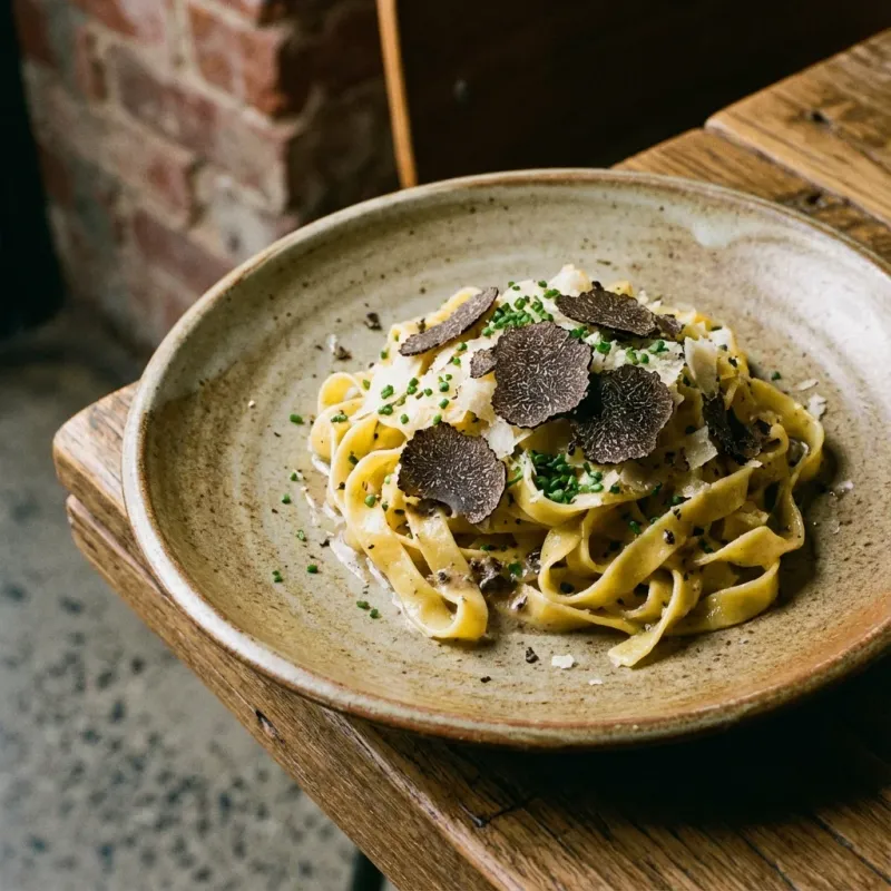
Professional food photography captures the texture, colour, and appeal of dishes in a way smartphone photos cannot—directly influencing ordering decisions.
Week 4: Development & Integration
We built the menu using Astro—a modern static-site framework that delivers lightning-fast HTML without database overhead or complex server requirements. The code included:
- Schema markup: Menu, MenuItem, and NutritionInformation structured data for rich search results
- WCAG 2.1 AA accessibility compliance: Proper heading hierarchy, sufficient colour contrast, keyboard navigation, screen reader compatibility
- Lazy loading: Images load only when scrolled into view, improving initial page speed
- Responsive images: Different image sizes served based on screen width and pixel density
- Dietary filtering: JavaScript-powered filters for GF, VG, VGN, DF options
Week 5: Testing & Launch
Before going live, we tested the menu across 20+ device and browser combinations, including older Android devices and slower network conditions (simulated 3G). We conducted real-user testing with 5 volunteers who had never seen the menu before, measuring time-to-first-order-decision.
After launch, we monitored Core Web Vitals daily for the first two weeks, tracking Largest Contentful Paint, First Input Delay, and Cumulative Layout Shift. We also set up enhanced Google Analytics 4 tracking to measure menu engagement and booking conversions.
Measurable Results: The Numbers Speak
Within three months of launching the new menu, the restaurant saw dramatic improvements across every key metric:
| Metric | Before Redesign | After Redesign | Change |
|---|---|---|---|
| Mobile bounce rate (menu page) | 62% | 28% | −55% |
| Average page load time (mobile) | 8.2 s | 1.4 s | −83% |
| Google Lighthouse score | 23 | 94 | +309% |
| Online bookings (monthly) | 147 | 194 | +32% |
| Organic search traffic (menu-related) | 210 visits/month | 520 visits/month | +148% |
| Average order value (online) | $42.50 | $48.90 | +15% |
| Time on menu page | 0:48 | 2:24 | +200% |
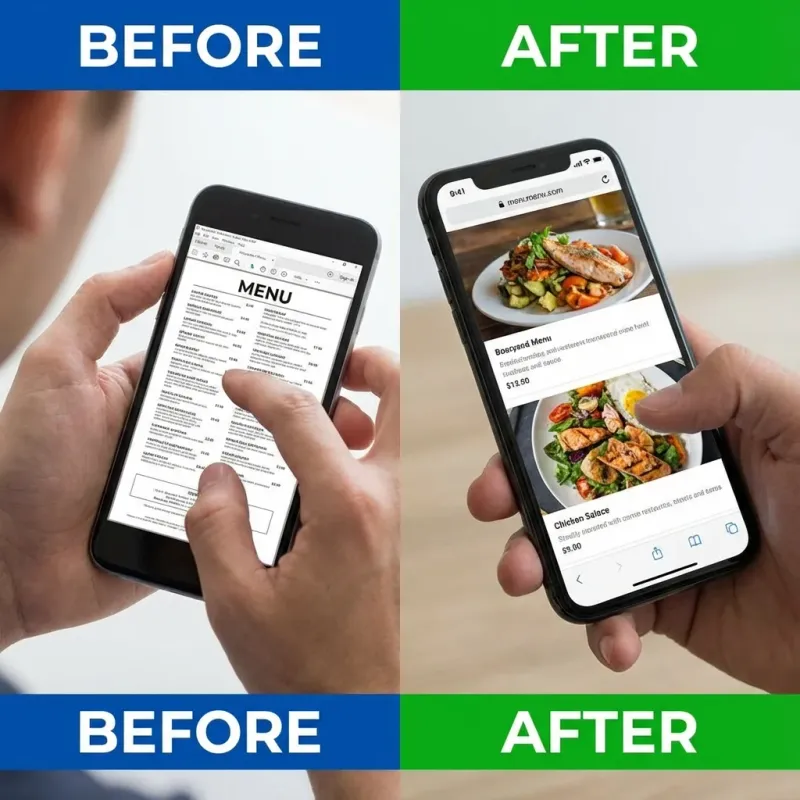
The difference is immediately visible: the old PDF required zooming to read anything, while the new HTML menu is designed for thumb-friendly browsing on any device.
The improved user experience also translated into higher customer satisfaction. Post-redesign surveys showed that 89% of diners found the new menu “much easier to use” on their phones, and 76% said the professional photos made them more likely to order a dish they hadn’t tried before.
ROI calculation: With 47 additional bookings per month at an average spend of $48.90, the menu redesign generated approximately $2,300 in additional monthly revenue. The project paid for itself in under 6 weeks.
Why This Worked for Perth Diners
Perth’s dining scene is uniquely mobile-driven. Tourists exploring Fremantle, locals searching for lunch in the CBD, office workers in West Perth planning team dinners, and families deciding on dinner in Subiaco—they all use their phones to decide where to eat. Often, the decision happens within minutes: search, browse menu, book or move on.
A menu that loads instantly, looks delicious, and works flawlessly on mobile isn’t just a nice-to-have in Perth—it’s a competitive necessity. The venues that win are the ones that respect their customers’ time and attention.
The redesign succeeded because it addressed three specific Perth-market demands:
- Speed for patchy mobile coverage: Perth has areas with inconsistent 4G coverage, especially in older buildings and basement venues. A fast-loading menu prevents frustration and abandonment where a PDF would timeout.
- Visual appeal matching venue quality: Perth diners expect high-quality imagery that reflects the venue’s atmosphere—whether it’s coastal casual in Cottesloe, urban sophistication in Northbridge, or heritage charm in Fremantle. Stock photos or smartphone snaps don’t cut it.
- Local SEO for dish-specific searches: By making every dish searchable with proper schema markup, the restaurant now appears in hyper-local queries like “best steak Mount Lawley,” “Sunday brunch Perth,” “gluten-free dinner Northbridge,” and “romantic restaurant Subiaco.”
New Search Rankings Achieved
Within 8 weeks of launch, the restaurant began ranking for dish-specific keywords it had never appeared for previously:
| Keyword | Previous Rank | New Rank |
|---|---|---|
| ”wagyu steak Northbridge” | Not ranking | #4 |
| ”vegan restaurant Northbridge” | Not ranking | #7 |
| ”gluten-free pasta Perth” | Not ranking | #11 |
| ”truffle dishes Perth restaurant” | Not ranking | #3 |
| ”best Italian Northbridge” | #18 | #6 |
These rankings represent entirely new traffic streams—customers who would never have found the restaurant through their previous PDF-based menu.
Key Takeaways for Other Perth Venues
This case study demonstrates that a well-executed menu redesign can deliver substantial, measurable returns. The core lessons for other Perth hospitality businesses:
- Ditch PDFs forever: HTML menus are faster, more accessible, and SEO-friendly. If you’re still using a PDF, you’re losing bookings every day. (Learn more in our pillar article Why Your PDF Menu is Killing Your Google Ranking.)
- Invest in professional photography: Great photos don’t just look nice—they increase order values by 10-20% and build trust before customers arrive. (See how professional photography drives ROI in Eat With Your Eyes: The ROI of Professional Food Photography.)
- Prioritise mobile performance: Google’s Core Web Vitals directly impact search rankings, and user patience on mobile is measured in seconds. A slow menu is a conversion killer. (Dive deeper into performance with Speed Kills (Competition): Why Fast Websites Get More Bookings.)
- Track the right metrics: Monitor bounce rate, load time, time on page, and organic search traffic to measure the impact of any changes—and justify future investment.
- Consider the full journey: Menu design works best when combined with booking integration, Google Business Profile optimisation, and consistent photography across all touchpoints.
Frequently Asked Questions: Menu Redesign
Ready to Transform Your Menu?
If your restaurant’s menu is stuck in the PDF era, you’re missing out on bookings, higher order values, and better search visibility every single day. The good news is that transforming your menu doesn’t require a complete website rebuild—we can often integrate a responsive, photography-driven menu into your existing site in a matter of weeks.
Want to see what a mobile-first menu could do for your venue? Explore our Perth restaurant website design services or book a free menu audit. We’ll analyse your current menu’s performance, identify the biggest opportunities, and provide a clear roadmap to increase your bookings—with projected ROI specific to your venue.
Related reading: Learn why PDF menus hurt your SEO, explore menu engineering strategies to boost profits, and see the ROI of professional food photography for Perth restaurants.