Rollout Context
Web application development: building five kitchen tools into a static site
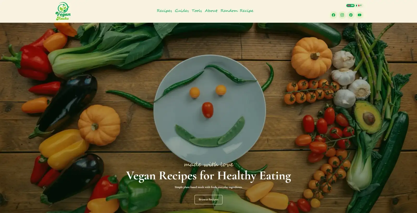
Vegan Hacks started from a simple observation: the internet does not need another vegan recipe blog, but vegan cooks do need better help in the kitchen.
Plant-based recipes are one of the most saturated content categories online. Competing on volume is a losing game — there will always be a site with more recipes, more backlinks and a decade’s head start. So the platform was built to compete on usefulness instead, which is a much narrower and more winnable position. The site is a set of working tools that happens to publish recipes, rather than a recipe archive with a few widgets attached.
That distinction drove the entire technical approach, and it is the part worth explaining.
The problem with “just add a plugin”
The obvious way to add a substitutions lookup or a recipe scaler to a food site is to install something. On WordPress that means a plugin; on most hosted platforms it means an embed.
Both approaches carry the same cost. The tool arrives as a black box, loads its own JavaScript framework, renders in an iframe or a shortcode you don’t control, styles itself however it likes, and often phones home. Add four of them and the site becomes slow, visually incoherent, and dependent on four separate vendors who can change their pricing or disappear.
The alternative is to build the tools yourself, and the objection is always the same: that means building an app, and an app is slow and expensive to maintain.
That objection is out of date. This site is fully static — every page is pre-built HTML — and the interactive tools are loaded as islands: small, self-contained React components that hydrate only on the pages that actually use them. A reader browsing a guide downloads no tool code at all. A reader who opens the ingredient converter downloads the converter, and nothing else.
You get application behaviour where it is genuinely needed, and a plain fast static page everywhere else.
The five tools
Each one exists because it answers a question that sends readers away from a recipe site to go and search separately.
- Substitutions finder. The most common vegan cooking question there is: what do I use instead of eggs, butter, honey, gelatine, fish sauce? It runs off a structured substitutions dataset rather than a wall of prose, so an answer is a lookup rather than a scroll.
- Ingredient converter. Cups to grams, millilitres to ounces, and the ingredient-specific conversions that generic converters get wrong — a cup of flour and a cup of oil do not weigh the same, and a converter that treats them identically is worse than none.
- Recipe scaler with shopping list. Scales a recipe to a different number of servings and produces a consolidated shopping list from the result. This is the largest of the tools, and the one that most clearly crosses from content into software.
- Meal helper. Recommends what to cook based on constraints — what you have, what you feel like, how much time there is — for the reader who does not have a specific dish in mind.
- Nutrition playground. Sits on the recipe page itself and lets readers toggle ingredients on and off, change servings and see nutrition update live, rather than reading one fixed table calculated for a serving size they are not making.
All five are written as React islands in the same codebase, sharing the same design tokens as the rest of the site. They look like part of the platform because they are part of the platform.
Where a static site needed a real backend
Two features could not be static, and it is worth being precise about how they were handled rather than pretending everything runs on pre-built HTML.
Recipe ratings and reviews need to persist across visitors, so they run through a server endpoint backed by Supabase. Submissions are validated server-side, and a review notification is sent through Resend. The endpoint is explicitly marked non-prerendered — it is the only part of the site that runs on request.
Site search went the other way. Rather than adding a hosted search service with a monthly cost and an external dependency, search is generated at build time with Pagefind, which indexes the built site and serves results from static files. Search works with no server, no API key and no per-query cost.
That split is the actual engineering judgement in this project: use a server only where state genuinely has to be shared between visitors, and solve everything else at build time. Most sites reach for a backend far earlier than they need one.
Bilingual as an architecture decision, not a translation layer
English and Italian were part of the content model from the first commit, not added later with a translation plugin.
Recipes and posts live under locale-scoped directories, routing is locale-aware, and each piece of content carries a translation key that links it to its counterpart. The recipe review system is locale-aware too — a review knows which language version it was left on.
The reason this matters is that retrofitting a second language is one of the most expensive changes you can make to a content site. URL structures have to change, which means redirects; every internal link has to become locale-aware; and search engines need consistent signals in both directions. Doing it at the start costs a few days. Doing it in year three costs a rebuild.
What this build actually demonstrates
Vegan Hacks is a food site, but the technical pattern is not about food at all.
It is the pattern for any business whose website needs to do something rather than just describe something: a calculator, a configurator, a quoting tool, a booking flow, a portal. The same architecture applies — a fast static site for the content, isolated interactive islands for the functionality, a server only where state must be shared, and build-time solutions wherever they will do the job.
That combination is what makes custom web development worth paying for over a template. A template can present your content. It cannot give your customers a tool that solves their actual problem, and it is the tool that makes people come back.
The result: a plant-based cooking platform that behaves like a kitchen companion rather than an archive. Five interactive tools built into the site rather than bolted onto it, ratings and reviews on a real backend, zero-cost static search, and English and Italian handled properly from the start.
Explore Vegan Hacks or read about our Web Development Perth service.