Rollout Context
Custom web development for a 1,100-page content platform
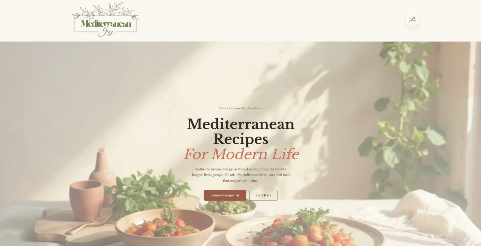
Mediterranean Joy was never meant to behave like a generic recipe blog. The goal was a platform with a clear editorial point of view, where recipes, long-form education and cultural context could live together without the site becoming bloated or directionless.
It is now 268 recipes and 218 educational posts, building out to roughly 1,130 pages. That scale is the interesting part of this project, because a content site of that size fails in ways a twenty-page site never does. The problems are not design problems. They are architecture problems, and they arrive whether you plan for them or not.
What breaks when a content site gets big
A recipe site with thirty recipes works no matter how it is built. Every page is reachable from the homepage, nothing is buried, and a visitor can see the whole thing in a couple of minutes.
At a thousand pages, three things break at once.
Discovery collapses. Most pages sit several clicks from the homepage, which means readers never find them and search engines crawl them rarely. Content you paid to produce sits unread.
The library becomes a maze. Without a deliberate structure, a large site is just a long reverse-chronological list. A reader interested in olive oil, or eating Mediterranean on a shift-worker’s schedule, has no path — only a search box and hope.
Consistency fails silently. Every recipe needs its structured data, nutrition information, images at the right sizes, and internal links. Done page by page, some will be wrong, and nobody will notice for months.
The build addressed each of these structurally rather than editorially, because at this scale “remember to do it properly each time” is not a strategy.
Twenty-seven hubs instead of one long list
The most consequential decision was organising the library around 27 topic hubs rather than categories and tags alone.
A hub is a substantial page owning one subject — olive oil, Mediterranean breakfast, anti-inflammatory eating, blood sugar, fermentation, athlete nutrition, eating Mediterranean in Australia, cooking for one, picky eaters — that links out to every recipe and article beneath it, with those pages linking back.
This is topical authority architecture, and it does two jobs simultaneously. For readers, it turns a thousand-page archive into about thirty comprehensible entry points; someone curious about olive oil gets a guided path instead of search results. For search engines, it groups related content into clusters that clearly demonstrate depth on a subject, rather than leaving a thousand pages competing individually with no signal about how they relate.
It also solves the discovery-collapse problem directly. Nothing is orphaned, because every recipe belongs to at least one hub, and every hub is reachable from the top of the site.
Recipe pages as content products
Recipe pages were built as flexible compositions rather than one rigid template, assembled from around sixteen dedicated components: jump links, an ingredient list, instruction steps, a nutrition panel, health callouts, storage notes, variations, FAQs, related recipes and more.
Two of those are worth calling out because they exist for the reader’s actual situation rather than the page’s appearance.
Cooking mode changes the page for someone standing in a kitchen — larger text, less chrome, no distractions — because that reader has different needs from someone browsing on a commute.
Generated recipe audio lets a recipe be listened to rather than read, for exactly the same reason: hands covered in flour, phone across the bench.
The nutrition playground is the most technically involved. Readers toggle ingredients on and off, swap components, change servings and units, and see nutrition recalculate live — rather than reading one fixed table computed for a serving size they are not cooking.
The publishing pipeline
At this volume, the work that would otherwise consume all the available time is not writing — it is everything that has to happen to each piece of content afterwards.
So that work was automated into the project’s own tooling: scripts that convert image assets to WebP in bulk, generate recipe audio, produce PDFs, and prepare and publish social packages. Publishing a recipe triggers the supporting assets rather than starting a checklist.
This is the part most content sites never build, and it is why most content sites plateau. The library stops growing not because the ideas run out, but because each new post costs an hour of mechanical work that nobody wants to do for the four hundredth time.
Fast, despite the size
The whole platform is static. Every one of those ~1,130 pages is pre-built HTML, served finished, with interactive features loaded as isolated islands only on the pages that use them — so a reader on a guide page downloads no tool code at all.
Search runs through Pagefind, indexed at build time and served from static files. On a site this size that decision matters: hosted search is typically priced per record or per query, and a thousand-page library with a search box on every page is exactly the shape that gets expensive. Here it costs nothing and depends on no third party.
Measured, it is good rather than perfect. Google Lighthouse scores the homepage 87 for performance on mobile and 93 on desktop (27 September 2026). The points lost on mobile are load time: on Lighthouse’s simulated mid-range phone over slow 4G, the first content appears at 2.6 seconds and the main content at 3.4 seconds, which is the next thing to tighten.
The result is a large content platform with the loading behaviour of a small one — which is not how large content platforms usually feel, and it is the single clearest argument for building this kind of site as custom web development rather than on a page-builder theme carrying its own overhead on every visit.
The result: a Mediterranean food platform of 268 recipes and 218 guides across roughly 1,130 pages, organised into 27 topic hubs so nothing is orphaned, with recipe pages built from composable components, live nutrition tooling, an automated asset pipeline, and zero-cost static search.
Explore Mediterranean Joy, or read more about our Web Development Perth service.