Why Most Perth Business Websites Fail at Conversion
Perth is full of good-looking websites that do not generate leads. We see it constantly: a local tradie, cafe, or professional services firm invests $3,000 to $8,000 in a new site, launches it, and then wonders why the phone is not ringing. The design looks polished, the photos are decent, and the logo sits neatly in the header. But none of that matters if the site was built without conversion principles baked into every page.
The gap between a website that looks professional and one that actually converts visitors into enquiries is not about aesthetics. It is about structure, hierarchy, and strategic intent. A conversion-focused website guides visitors through a deliberate sequence: understand, trust, act. Most sites skip straight to “here’s what we do” and hope for the best.
These 10 principles are the difference. They are not theoretical — they are drawn from real UX data, tested across dozens of Perth business websites, and applicable whether you are building from scratch or deciding whether your current site needs a redesign.
The 10 Conversion Principles
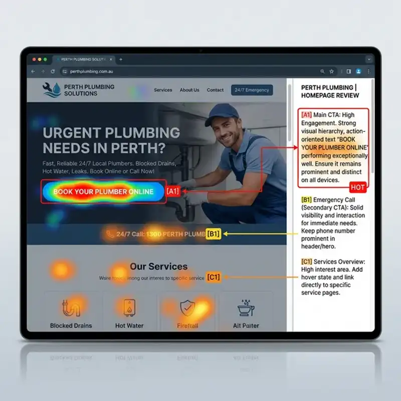
1. Above-the-Fold Clarity
The first screen a visitor sees — before any scrolling — is your highest-value real estate. Within 3 seconds, a new visitor should be able to answer three questions: What does this business do? Who is it for? What should I do next?
Most Perth business websites waste this space with a full-width hero image, a vague tagline like “Excellence in Service,” and no clear next step. Compare that with a headline that reads: “Custom Cabinetry for Perth Homes — Free Measure and Quote.” The second version tells you everything. The first tells you nothing.
Your above-the-fold content should include a benefit-driven headline, a one-line supporting statement, and a single visible CTA button. If a visitor has to scroll to understand what you do, you have already lost a significant percentage of your traffic.
2. Single Primary CTA Per Page
Decision fatigue kills conversion. When a page presents “Call Us,” “Email Us,” “Download Our Brochure,” “Follow Us on Instagram,” and “Read Our Blog” all at equal visual weight, the visitor does none of them. This is Hick’s Law in action — the more choices you present, the longer it takes to decide, and the more likely someone is to leave.
Every page on your site should have one primary action you want the visitor to take. On your homepage, that might be “Get a Free Quote.” On a service page, it could be “Book a Consultation.” Secondary actions can exist, but they should be visually subordinate — smaller, less prominent, and positioned below the primary CTA.
We have seen Perth service businesses lift enquiry rates by 40 to 60 percent simply by reducing their homepage to a single, clear call to action. If you are designing a dedicated landing page for lead capture, this principle becomes even more critical.
3. Visual Hierarchy That Guides the Eye
Visitors do not read websites — they scan them. Eye-tracking studies consistently show an F-pattern for text-heavy pages and a Z-pattern for more visual layouts. Your design needs to work with these natural scanning behaviours, not against them.
Visual hierarchy is established through size, colour, contrast, and spacing. Your most important message should be the largest, highest-contrast element on the page. Supporting information steps down in size and weight. Navigation and footer content sit at the lowest level.
A practical test: squint at your homepage. Can you still identify the headline, the main image, and the CTA button? If everything blurs into a uniform block, your hierarchy needs work. Strong hierarchy means visitors absorb your key message even at a glance.
4. Trust Proof Before the Fold
Perth consumers are cautious buyers. Before they click your CTA, they need a reason to believe you can deliver. Trust signals — logos of clients you have worked with, a star rating, an industry certification badge, or a brief testimonial — should appear within or immediately below the hero section.
This is not about cramming your entire portfolio above the fold. A single row of four to six client logos, a “4.9 stars from 120+ Google reviews” badge, or a one-line testimonial from a recognisable local business is enough. The goal is to reduce perceived risk before asking someone to commit to an action.
Businesses that move trust proof from a buried “Testimonials” page into the hero area typically see a measurable lift in form submissions. If you are working on your website development, plan trust elements into the layout from the wireframe stage — not as an afterthought.
5. Speed as a Conversion Lever
Google’s own data shows that as page load time increases from 1 to 3 seconds, the probability of a visitor bouncing increases by 32 percent. At 5 seconds, that figure rises to 90 percent. For Perth businesses competing in local search, a slow site is not just a UX problem — it is a revenue problem.
The technical foundations matter: compressed images in WebP format, minimal JavaScript, efficient hosting, and proper caching. But speed is also a design decision. Every decorative animation, auto-playing video, and oversized background image adds load time. If a visual element does not serve conversion, it should not be on the page.
Aim for a Largest Contentful Paint (LCP) under 2.5 seconds and a Cumulative Layout Shift (CLS) below 0.1. These are not vanity metrics — they directly correlate with how many visitors stick around long enough to become leads. If your current site is struggling, read our guide on mobile-first UX fixes for Perth businesses.
6. Mobile-First Form Design
Over 65 percent of local business website traffic in Perth comes from mobile devices. Yet many contact forms are still designed for desktop: tiny input fields, dropdowns that are hard to tap, and forms that require 8 or more fields before a visitor can submit.
A conversion-optimised form on mobile has three to four fields maximum for initial contact: name, phone or email, and a brief message. Use large tap targets (minimum 48px height), appropriate input types (tel for phone numbers, email for email addresses), and a submit button that is impossible to miss.
Consider the psychology too. Every additional field you add creates friction. If you need detailed project information, collect it in a follow-up conversation rather than gatekeeping the initial enquiry behind a 12-field form. The goal of the first form is to start the conversation, not to qualify the entire project.
7. Social Proof Placement Strategy
Most websites treat testimonials as a single block — a “What Our Clients Say” section somewhere near the bottom of the homepage. That is better than nothing, but it wastes the persuasive power of social proof by divorcing it from the moments where visitors are making decisions.
Strategic placement means positioning relevant proof next to relevant content. A testimonial about your design process belongs on the service page, not the homepage. A review mentioning fast turnaround should sit near your CTA, where a visitor is weighing whether to commit. Case study results belong alongside your pricing or packages.
The format matters as well. Google review embeds with star ratings outperform plain-text quotes. Video testimonials outperform written ones. Named testimonials with a business name and suburb (e.g., “Sarah M., Subiaco”) outperform anonymous quotes. Give your social proof specificity and context, and place it where it does the most work.
8. Benefit-Led Headings Over Feature Lists
“We use the latest technology” is a feature. “Your website loads in under 2 seconds so you never lose a visitor” is a benefit. The difference is crucial: features describe what you do, benefits describe what the customer gets. Visitors care about outcomes, not processes.
Audit every heading on your website. If it starts with “We” or “Our,” it is probably feature-focused. Reframe it from the visitor’s perspective. Instead of “Our Web Design Process,” try “How Your New Website Comes Together in 4 Weeks.” Instead of “Our Team,” try “The People Behind Your Project.”
This applies to service pages, about pages, and especially your homepage. Every heading is a micro-commitment from the visitor — they are choosing to keep reading. Benefit-led headings reward that choice by answering “what’s in it for me?” at every scroll point.
9. White Space as a Persuasion Tool
Inexperienced designers fill every pixel. Experienced designers know that white space — the empty area between and around elements — is not wasted space. It is a tool that increases readability, draws attention to key elements, and creates a sense of quality and professionalism.
Research from the Wichita State University found that increased white space around text and between paragraphs improves reading comprehension by up to 20 percent. For a business website, that means visitors are more likely to understand your message, remember it, and act on it.
Practically, this means generous padding around CTA buttons (so they stand out rather than blending into surrounding content), consistent spacing between sections, and enough line height in body text for comfortable reading. If your website feels “busy” or overwhelming, the fix is almost always more space, not more content.
10. Measurable Goals Built Into Every Page
A page without a defined conversion goal is a page that cannot be improved. Before you design or redesign any page on your site, answer this: What is the one thing I want a visitor to do after viewing this page?
For your homepage, the goal might be “navigate to a service page” or “submit a contact form.” For a blog post, it could be “click through to a service page” or “download a resource.” For a service page, the goal is almost always “make an enquiry.”
Once every page has a defined goal, you can measure it. Set up goal tracking in Google Analytics (or your analytics platform of choice), establish a baseline, and then test changes against that baseline. Without measurement, you are guessing. With it, you are optimising — and that is the difference between a website that costs money and one that makes it.
Conversion Checklist for Perth Business Websites
Use this checklist to audit your current site or brief a designer on your next project:
- Above-the-fold clarity: Headline, supporting line, and CTA visible without scrolling
- Single primary CTA: One dominant action per page, visually distinct from secondary options
- Visual hierarchy: Squint test passes — headline, image, and CTA identifiable at a glance
- Trust proof early: Client logos, star ratings, or testimonial within or just below the hero
- Page speed: LCP under 2.5 seconds, CLS below 0.1 on mobile
- Mobile-first forms: Three to four fields, large tap targets, appropriate input types
- Strategic social proof: Testimonials placed near decision points, not buried on a separate page
- Benefit-led headings: Every heading answers “what’s in it for me?” from the visitor’s perspective
- Intentional white space: Generous padding around CTAs, consistent section spacing, comfortable line height
- Measurable goals: Every page has a defined conversion action tracked in analytics
Where to Start if Your Current Site Is Underperforming
You do not need to overhaul everything at once. If your site is generating some traffic but not enough enquiries, start with the top three highest-impact changes:
- Rewrite your homepage headline to clearly state what you do, who you serve, and what the visitor should do next
- Reduce your contact form to name, email or phone, and a single message field
- Add trust proof to your hero area — a Google review badge, three client logos, or a brief testimonial
These three changes alone can shift a 0.5 percent conversion rate to 2 percent or higher. Once those foundations are in place, work through the rest of the checklist systematically. For landing pages built specifically for lead capture, apply all 10 principles from the start — there is no room for wasted space on a single-purpose page.
Book a Conversion-Focused Web Design Audit
At Amplify Creative Lab, we design websites for Perth businesses that do more than look good — they generate measurable leads, calls, and sales. Every site we build starts with conversion strategy before a single pixel is placed.
If your current website is not pulling its weight, we offer a conversion-focused audit that pinpoints exactly where visitors are dropping off and what to fix first. You will receive a prioritised action plan with specific, implementable recommendations.
Book your web design audit and find out what your website should be doing for your business.
See our web design services or explore our full website development offering for Perth businesses.