Why Fonts Matter More Than You Think
Before a visitor reads a single word on your website, your typography has already made an impression. The shape, weight, and spacing of your letters communicate personality, professionalism, and intent — all within milliseconds. For Perth businesses competing in crowded local markets, this first impression can be the difference between a customer who stays and one who bounces.
Typography is not decoration. It is a strategic branding tool. The best fonts for business branding are chosen deliberately to reinforce the message your brand needs to communicate. A law firm in the Perth CBD and a surf shop in Scarborough should never use the same typeface — and understanding why comes down to font psychology.
The Four Font Families and What They Signal
Every typeface belongs to a broader classification, and each classification carries a distinct psychological association. Here is what your customers subconsciously feel when they encounter each one.
Serif Fonts: Trust, Tradition, Authority
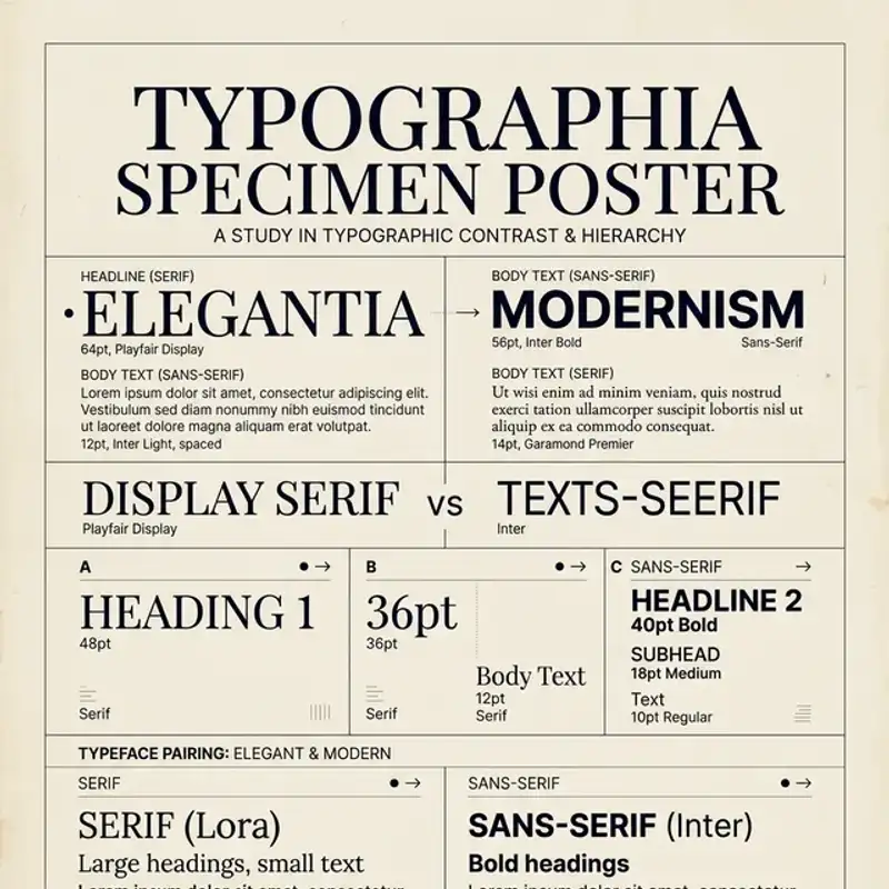
Serif typefaces — those with small strokes (serifs) extending from the ends of letterforms — are the oldest classification in modern typography. Think Garamond, Playfair Display, and DM Serif Display. They carry associations of heritage, reliability, and intellectual weight.
Best for: law firms, financial advisers, premium real estate, established brands, and any Perth business that wants to communicate longevity and trustworthiness.
Watch out for: using overly ornate serifs at small sizes on screens, where they can become difficult to read. Stick to serifs with generous x-heights for digital use.
Sans-Serif Fonts: Modern, Clean, Approachable
Sans-serif typefaces — without the decorative strokes — dominate the digital landscape for good reason. Fonts like Inter, Poppins, and Work Sans render crisply on screens and feel contemporary and accessible. They are the workhorses of modern brand identity.
Best for: tech companies, startups, e-commerce stores, health and wellness brands, and any business that wants to appear forward-thinking and approachable.
Watch out for: choosing a sans-serif that is too generic. Helvetica and Arial are safe but forgettable. A distinctive geometric sans like Outfit or a humanist sans like Source Sans Pro gives you personality without sacrificing readability.
Script and Handwritten Fonts: Elegance, Creativity, Warmth
Script typefaces mimic cursive handwriting and range from formal calligraphic styles to casual brush lettering. They can add personality and warmth, but they require careful handling.
Best for: boutique retail, beauty and skincare brands, wedding services, artisan food producers, and creative studios. A Perth bakery or a Fremantle florist might use a refined script for their wordmark while keeping body text in a clean sans-serif.
Watch out for: legibility. Script fonts should almost never be used for body text, navigation, or any block of content longer than a few words. Reserve them for logos, taglines, and decorative headlines.
Display and Slab-Serif Fonts: Bold, Confident, Distinctive
Display typefaces are designed to be seen at large sizes — think posters, hero banners, and packaging headlines. Slab-serifs like Roboto Slab or Zilla Slab add weight and presence without the formality of traditional serifs.
Best for: hospitality venues, breweries, outdoor brands, and any business that wants to make a strong visual statement. Several Perth cafes and craft breweries use bold slab-serifs to stand out in a market saturated with minimalist sans-serif identities.
Watch out for: overusing display fonts across your entire design system. They are designed for impact at scale — use them for headings and hero sections, not for paragraphs or captions.
Practical Font Pairing Rules
Choosing one typeface is only half the challenge. Most brands need at least two — a heading font and a body font — and those two need to work together without competing. Here are the rules that separate effective pairings from amateur ones.
Rule 1: Contrast, Not Conflict
The best font pairings create contrast between heading and body text while maintaining visual harmony. A serif heading paired with a sans-serif body is the most reliable combination — the structural difference between the two creates natural hierarchy without visual tension.
Strong pairings:
- Playfair Display + Inter: elegant headings with a clean, modern body font — works well for premium brands and professional services
- DM Serif Display + Work Sans: warm, authoritative headings with a friendly, readable body — ideal for hospitality and lifestyle brands
- Outfit + Lora: geometric sans-serif headings with a transitional serif body — suits creative agencies and design studios
- Poppins + Source Serif Pro: geometric, contemporary headings with a refined serif body — effective for tech and finance
Rule 2: Limit Yourself to Two (Maybe Three)
Every additional typeface you introduce weakens your brand system. Two is the standard: one for headings, one for body. If you absolutely need a third — for pull quotes, callout boxes, or accent text — make sure it serves a clear purpose and does not fight for attention.
Brands that use four or more typefaces across their marketing materials tend to look disorganised, even if each individual font is well-chosen. Restraint is a design skill. If you are building a brand identity from scratch, locking down your type system early prevents drift later.
Rule 3: Match the Mood to Your Audience
Your font pairing should reflect how your audience wants to feel — not just how you want to look. A boutique accounting firm in Subiaco needs typography that communicates competence and calm. A surf school in Scarborough needs something energetic and informal. Both can be well-designed, but they require fundamentally different type choices.
Ask yourself: if your brand were a person, how would they speak? Formal or casual? Reserved or expressive? Traditional or progressive? Your typefaces should mirror that voice.
Rule 4: Test at Every Size
A font pairing that looks elegant in a Canva mockup can fall apart on a mobile screen or a printed business card. Always test your type choices at:
- 16px body text on mobile: is it readable without zooming?
- Hero banner headings: does the heading font hold its personality at 48px and above?
- Small print: do captions, footers, and fine print remain legible at 12-14px?
- Print at 300 DPI: do the fonts render cleanly on business cards, brochures, and signage?
Typography for Web: Readability That Converts
On the web, typography is not just about aesthetics — it directly affects usability, accessibility, and conversion rates. Research consistently shows that readable, well-spaced text increases time on page and reduces bounce rates. Here are the technical foundations every Perth business website should follow.
Body Text Size and Line Height
Set your body text at a minimum of 16px — 18px is even better for content-heavy pages. Line height (leading) should sit between 1.5 and 1.75 times the font size. Cramped text exhausts readers and drives them away before they reach your call to action.
Colour Contrast
WCAG 2.1 guidelines require a minimum contrast ratio of 4.5:1 for body text and 3:1 for large text. Light grey text on a white background might look “clean” in a design concept, but it fails accessibility standards and punishes anyone reading on a screen in bright Perth sunlight. Dark text on a light background remains the safest, most readable combination.
Font Loading Performance
Every custom font you load adds weight to your page. A single typeface with four weights (regular, italic, bold, bold italic) can add 100-200KB to your initial load. Use font-display: swap to prevent invisible text during loading, and subset your fonts to include only the characters your content actually uses.
Google Fonts handles optimisation automatically for web use, which is one reason they remain a strong default for Perth small businesses. If you are working with a graphic design team, ensure they specify both web and print versions in your brand guidelines.
Responsive Typography
Your headings should scale down gracefully on smaller screens. A 64px heading that works on desktop can overflow on mobile if you are not using responsive sizing. Use CSS clamp() or fluid type scales to ensure your typography adapts to every viewport without manual breakpoints.
Typography for Print: What Changes
Web typography and print typography share principles but diverge in execution. If your Perth business produces brochures, packaging, signage, or business cards alongside your website, you need to understand the differences.
Serif Fonts Shine in Print
While sans-serifs dominate screens, serif fonts remain the standard for long-form print reading. The serifs guide the eye along lines of text, improving readability in paragraphs. Annual reports, magazines, and brochures typically pair a sans-serif heading with a serif body — the opposite of most web conventions.
Colour Mode Matters
Fonts rendered in CMYK for print can look different from their RGB screen equivalents. Black text in print should be set as 100% K (not rich black) for body copy to avoid registration issues. Your designer should be converting colour profiles correctly — this is a common source of muddy-looking printed materials.
Licensing
Google Fonts are free for both web and print. However, many premium typefaces from foundries like Klim Type Foundry, Colophon, or Commercial Type have separate licences for desktop, web, and app use. If you have invested in a premium typeface for your logo and visual direction, confirm that your licence covers all intended applications before your designer starts production.
Common Typography Mistakes Perth Businesses Make
After working with dozens of Perth brands, we see the same typography errors repeatedly. Here are the most damaging ones and how to avoid them.
Using Too Many Fonts
The most common mistake. A business picks one font for their logo, another for their website headings, a third for their business cards, and a fourth for social media. The result is a brand that looks like it was designed by four different people — because it was. If you are building a complete identity system, typography should be one of the first decisions, not an afterthought.
Choosing Style Over Substance
Decorative fonts are tempting, but they rarely serve your business well beyond a logo or headline. If your customers cannot read your menu, navigation, or product descriptions comfortably, no amount of visual flair will save you. Function first, style second.
Ignoring Mobile Readability
More than 60% of web traffic in Australia comes from mobile devices. If your type is too small, too tightly spaced, or too decorative to read on a phone screen, you are alienating the majority of your audience. Test on real devices, not just desktop previews.
Inconsistent Weight Usage
Using bold, semi-bold, medium, and regular weights inconsistently across your website and marketing materials weakens visual hierarchy. Define which weights serve which purpose — for example, Bold for headings, Medium for subheadings, Regular for body — and stick to those rules everywhere.
Skipping Brand Guidelines
Typography decisions that live only in a designer’s head get lost the moment someone else touches your marketing. Document your type choices, sizes, weights, and spacing rules in a brand guideline document. It does not need to be elaborate — even a single page covering your type system prevents drift.
Building Your Brand Typography System
A practical typography system for a Perth small business does not need to be complex. Here is a simple framework you can follow.
- Primary typeface (headings): choose a font with personality that reflects your brand’s character — serif for tradition, sans-serif for modernity, display for boldness
- Secondary typeface (body): choose a highly readable font that contrasts with your heading font — prioritise legibility at small sizes
- Weight hierarchy: define Bold for H1/H2 headings, Semi-bold or Medium for H3/subheadings, Regular for body text, and Light (if available) for captions or metadata
- Size scale: set a base size (16-18px for web) and use a consistent scale ratio (1.25 or 1.333) for heading sizes
- Spacing rules: define line height, letter-spacing, and paragraph spacing for both web and print applications
Document everything. Share it with every designer, developer, and content creator who touches your brand. Consistency compounds — the longer you maintain a unified type system, the stronger your brand recognition becomes.
Request a Typography Audit
At Amplify Creative Lab, we help Perth businesses build brand identity systems where every element — from logo to website to packaging — works together. Typography is one of the foundations we get right first, because it touches everything your audience sees.
If your current type choices feel inconsistent, outdated, or accidental, we can audit your existing typography and recommend a system that strengthens your brand across every channel.
Get in touch to request a typography audit and brand identity review.
See our logo and brand identity services or read about what goes into a complete identity system.