Why These Case Studies Matter for Perth Businesses
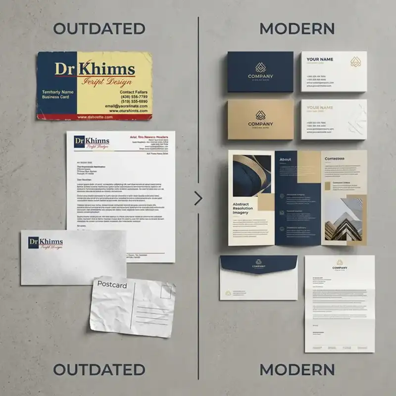
Rebranding is one of the most significant investments a small business can make. It touches everything — your signage, your website, your packaging, your social media, your customer relationships. Get it right and you unlock new growth. Get it wrong and you confuse the market you have spent years building.
The challenge is that most rebranding advice is generic. It tells you what to do in theory but not what it actually looks like in practice. That is why we have put together three anonymised case studies from real Perth businesses that went through a rebrand in the past two years. Each one covers the trigger, the process, the results, and the lesson you can take away for your own business.
If you are weighing up whether to invest in a brand identity overhaul, these stories should help you understand what to expect — and what to avoid.
Case Study 1: The Fremantle Cafe That Outgrew Its Brand
The Trigger
A popular brunch cafe on the Fremantle cappuccino strip had been trading for seven years. The original branding — a hand-drawn logo, pastel colour palette, and rustic fonts — was created on a tight budget when the owner opened with just six tables. By 2025, the business had expanded to 80 seats across indoor and courtyard areas, launched a catering arm, and started wholesaling house-made granola to local retailers.
The problem was clear: the brand still looked like a tiny startup. Wholesale buyers told the owner the packaging felt “homemade” rather than “artisan.” Catering clients struggled to find the business online because the visual identity was inconsistent across Google, Instagram, and the website. The brand had not kept pace with the business.
The Process
The rebrand took eight weeks and followed a structured approach:
- Week 1-2 — Discovery: Stakeholder interviews with the owner, head chef, and two long-standing staff members. Competitive audit of six comparable Fremantle and Perth CBD venues. Customer perception survey sent to the email list (142 responses).
- Week 3 — Strategy: Brand positioning statement, updated value proposition, and tone of voice guidelines. The key insight was that the business needed to feel “established and premium” without losing the warmth that regulars loved.
- Week 4-5 — Creative development: Three logo concepts explored, each with supporting colour palette, typography system, and mockup applications. The chosen direction used a custom wordmark with a subtle leaf motif that referenced the courtyard garden.
- Week 6-7 — Refinement and guidelines: Final logo suite (primary, secondary, icon), brand guidelines document, packaging templates for the granola range, and social media templates.
- Week 8 — Rollout planning: Coordinated launch across updated signage, new menus, refreshed website, Google Business Profile update, and an Instagram reveal campaign.
The Outcome
Within three months of the rebrand launch, the cafe reported a 22% increase in catering enquiries and secured two new wholesale accounts — both of whom cited the “professional packaging” as a deciding factor. Instagram engagement increased by 35% in the first month after the reveal campaign. The owner noted that the brand guidelines saved time because staff and suppliers no longer had to guess which logo version or colour to use.
Key Lesson
Your brand needs to match your business today, not the business you were five years ago. If your operations have evolved but your identity has not, you are leaving credibility — and revenue — on the table.
Case Study 2: The Joondalup Fitness Studio Facing Market Confusion
The Trigger
A boutique fitness studio in Joondalup offered a mix of reformer Pilates, strength training, and recovery services. The original branding leaned heavily into a “hardcore gym” aesthetic — dark colours, aggressive typography, and imagery that skewed toward bodybuilders. The problem was that 70% of their actual clientele were women aged 30-55 seeking low-impact fitness and rehabilitation.
The disconnect was costing the business. Potential clients would visit the website, see the aggressive branding, and assume the studio was not for them. The owner was spending heavily on Facebook ads to counteract the first impression, but conversion rates stayed stubbornly low at 1.8%.
The Process
This rebrand took ten weeks due to the strategic depth required:
- Week 1-2 — Discovery and research: Analysis of the existing client base (demographics, motivations, feedback). Competitor audit of seven Perth fitness studios with similar offerings. The research confirmed a significant gap between brand perception and actual service delivery.
- Week 3-4 — Strategic repositioning: New brand positioning centred on “strength through balance” rather than intensity. Updated target audience personas. Revised messaging framework that emphasised expertise, community, and personalised programming.
- Week 5-7 — Creative development: The visual identity shifted to a warm neutral palette with a deep teal accent, clean sans-serif typography, and photography direction that featured real clients rather than stock fitness imagery. The logo was designed for scalability — working equally well on a shopfront sign, an embroidered towel, and a 60-pixel app icon.
- Week 8-9 — Asset production: Website redesign with updated photography, social media template suite, email signature designs, merchandise designs (water bottles, towels), and window signage files.
- Week 10 — Rollout: Soft launch to existing members first (exclusive preview event at the studio), followed by public launch with a coordinated social media campaign and Google Business Profile update.
The Outcome
The results were striking. Website conversion rates jumped from 1.8% to 4.3% within two months — a 139% improvement — without increasing ad spend. The studio reported a 40% increase in trial bookings in the first quarter after the rebrand. Equally telling, the owner stopped receiving enquiries about bodybuilding programs, which had previously wasted staff time. Member retention also improved by 15%, which the owner attributed to the sense of renewed investment in the business.
Key Lesson
If your brand attracts the wrong audience, you pay twice — once to reach people and again when they do not convert. Aligning your visual identity with your actual service offering is one of the highest-ROI investments a Perth business can make.
Case Study 3: The Perth CBD Consulting Firm That Needed Credibility
The Trigger
A management consulting firm in the Perth CBD had been operating for four years. The two founders had built a strong client base through referrals, but they were losing competitive tenders to larger firms. Feedback from procurement teams was consistent: the firm’s proposals looked “small” and “unpolished” compared to competitors. The logo was a generic icon from a $50 online service, the website was a basic template, and there were no brand guidelines — every document looked different.
The founders realised that their brand was undermining their expertise. They needed to look as capable as they actually were.
The Process
This was the most strategically complex of the three rebrands, taking twelve weeks:
- Week 1-3 — Discovery: Deep dive into the competitive landscape, including visual audits of eight competing Perth and national consulting firms. Client interviews (six current clients provided candid feedback). Internal workshop to define the firm’s values, differentiators, and aspirational positioning.
- Week 4-5 — Naming and strategy: The firm opted to keep its existing name but developed a new tagline, refined its service descriptions, and created a messaging hierarchy for different audiences (C-suite, procurement, HR).
- Week 6-8 — Visual identity: A complete identity system was developed. The logo used a geometric monogram with a sophisticated navy and gold palette. Typography paired a refined serif for headings with a clean sans-serif for body text. A custom icon set was created for the firm’s six service pillars.
- Week 9-10 — Collateral design: Proposal template suite (PowerPoint and Word), business cards, email signatures, LinkedIn banners, capability statement, and a one-page overview for networking events. Every document was designed to reinforce credibility and consistency.
- Week 11-12 — Digital rollout: New website build, Google Business Profile update, LinkedIn company page refresh, and a targeted announcement campaign to existing clients and referral partners.
The Outcome
The firm won three competitive tenders in the first six months after rebranding — two of which were against national firms they had previously lost to. One procurement manager specifically mentioned that the proposal “looked like it came from a firm that takes quality seriously.” The founders also reported that the brand guidelines saved an estimated five hours per week on document preparation because templates were now consistent and professional. Staff morale improved as well; two senior consultants mentioned that the rebrand made them prouder to represent the firm.
Key Lesson
In professional services, perception is a gatekeeper. If your brand does not match your capability, you will lose opportunities to competitors who simply look more credible — even if your work is superior.
Common Patterns Across All Three Rebrands
Looking at these three Perth businesses together, several patterns emerge that are worth noting if you are considering your own rebrand:
- Discovery was non-negotiable: Every successful rebrand started with research — customer interviews, competitive audits, and honest internal assessment. Skipping this phase would have led to a brand that looked different but still missed the mark.
- Strategy came before design: None of these projects jumped straight to logo concepts. The positioning, messaging, and audience alignment were defined first, and the visuals followed from those decisions.
- Rollout was planned in advance: A new logo sitting in a folder is not a rebrand. Each business coordinated a launch that touched every customer-facing channel simultaneously — signage, website, social media, print collateral, and Google Business Profile.
- Results were measured: All three businesses tracked specific metrics before and after the rebrand. This turned the investment from “we hope it works” into “we can prove it worked.”
- Guidelines prevented drift: Brand guidelines were not a luxury add-on. They were the tool that ensured consistency across staff, suppliers, and platforms — and they saved time every week.
How to Know If Your Perth Business Is Ready to Rebrand
Not every business needs a full rebrand. Sometimes a visual refresh — updated colours, refined typography, a modernised logo — is enough. Here is a quick framework to help you decide:
You Probably Need a Full Rebrand If:
- Your business model, services, or target audience have significantly changed
- Your brand is frequently confused with a competitor
- You are losing opportunities because your brand looks unprofessional or outdated
- Your messaging no longer reflects your values or positioning
- You are expanding into new markets or launching new product lines
A Visual Refresh May Be Sufficient If:
- Your brand positioning is still accurate and resonant
- Your logo works well but feels slightly dated
- You need better consistency across channels but not a new direction
- Your business has not fundamentally changed — it has simply grown
If you are unsure where you sit, a professional brand audit can help you identify exactly what needs to change and what should stay.
What a Rebrand Investment Looks Like in Perth
Based on these case studies and our broader experience working with Perth businesses, here is a realistic breakdown of what you can expect:
- Visual refresh (logo, colours, typography): $3,000 - $7,000
- Mid-range rebrand (strategy + visual identity + key collateral): $8,000 - $15,000
- Comprehensive rebrand (full strategy, identity system, collateral suite, rollout support): $15,000 - $25,000+
The right investment depends on your business size, the complexity of your brand touchpoints, and how deep the strategic work needs to go. What all three case studies demonstrate is that the return on investment — in new clients, higher conversion rates, and time savings — typically pays for itself within the first year.
Ready to Explore a Rebrand for Your Perth Business?
At Amplify Creative Lab, we work with Perth businesses across hospitality, professional services, fitness, retail, and more to develop brand identities that are strategic, scalable, and built for growth. Every project starts with understanding your business — not jumping straight to design.
Request a branding quote and let us walk you through our process, timeline, and what a rebrand could look like for your business.
Learn more about our logo and brand identity services, explore our graphic design capabilities, or read about building a complete brand identity system.