Why the Distinction Matters
If you have ever sent a design to a Perth print supplier and received something that looked nothing like your screen, you have experienced the core problem this guide addresses. Print and digital design operate under fundamentally different technical rules. Colour behaves differently, resolution requirements are different, file formats serve different purposes, and the way typography renders on paper versus a screen can transform the feel of a design entirely.
For Perth businesses that need both print and digital assets — and most do — understanding these differences saves money, prevents reprints, and ensures your brand looks consistent across every touchpoint. Whether you are producing marketing collateral for B2B sales or building a digital campaign, the technical foundations matter.
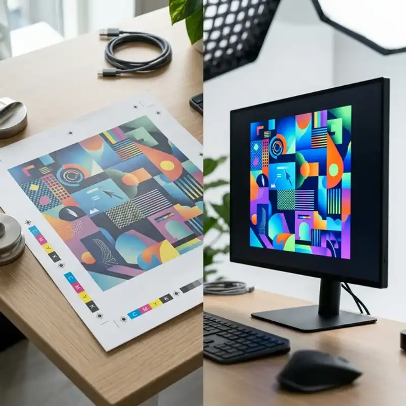
Colour Systems: CMYK vs. RGB
How RGB Works
RGB stands for Red, Green, and Blue — the three colours of light that screens use to create every colour you see on a monitor, phone, or tablet. RGB is an additive colour model: combining all three at full intensity produces white. Your website, social media graphics, email templates, and digital ads all use RGB colour.
The RGB gamut is wide — it can produce vivid neons, electric blues, and bright greens that look stunning on screen. This is also where the problem starts, because many of those vivid colours simply cannot be reproduced in print.
How CMYK Works
CMYK stands for Cyan, Magenta, Yellow, and Key (Black) — the four ink colours used in commercial printing. CMYK is a subtractive colour model: inks absorb light rather than emitting it, so combining all four produces a near-black. Every business card, brochure, banner, and packaging label you have ever held was printed using some combination of these four inks.
The CMYK gamut is narrower than RGB. Certain colours — particularly bright purples, vivid oranges, and neon greens — fall outside what CMYK can reproduce. When a design created in RGB is converted to CMYK for printing, these out-of-gamut colours shift to the closest reproducible alternative, often appearing duller or muddier than expected.
Practical Impact
The rule is simple: always design for print in CMYK from the start. Converting an RGB file to CMYK at the end of the project is a compromise — you lose control over how colours shift. If your brand identity system specifies both RGB and CMYK values for every colour (and it should), you can design confidently for both outputs from day one.
For colours that must be exact — brand colours, Pantone-matched elements, or metallic inks — talk to your printer about spot colour options. Spot colours use pre-mixed inks rather than CMYK builds, producing more accurate and consistent results.
Resolution: DPI vs. PPI
Print: 300 DPI Minimum
DPI (dots per inch) describes how many ink dots a printer places in each inch of the printed output. The industry standard for commercial print is 300 DPI at the final printed size. At this resolution, individual dots are invisible to the naked eye, and images appear sharp and detailed.
The critical phrase is “at the final printed size.” A 300 DPI image at 5x7 cm does not remain 300 DPI if you scale it up to A3. When you enlarge an image, the pixels spread apart, and DPI drops proportionally. An image that looks crisp at business card size may be unacceptably blurry on a poster. Always check resolution at the actual size the image will be printed.
Digital: 72-150 PPI
PPI (pixels per inch) describes pixel density on screens. Standard web images use 72 PPI, while retina and high-density displays use 144-150 PPI. Digital images are optimised for fast loading — smaller file sizes, compressed formats like WebP or JPEG, and resolutions that look sharp on screen without consuming excessive bandwidth.
Using a 72 PPI web image in a print layout is one of the most common mistakes Perth businesses make. The image may look fine on your screen because your monitor displays it at screen resolution. But when printed at 300 DPI, the same image will appear pixelated, soft, and unprofessional.
The Bottom Line
Source images at the highest resolution available. It is always possible to reduce resolution for digital use, but you cannot add detail to a low-resolution image. Start high, export low for digital, and keep originals archived for future print needs.
Bleed, Trim, and Safe Zones
These three zones are fundamental to print design and have no equivalent in digital work.
Bleed (3mm Beyond Trim)
Bleed is the area of your design that extends beyond the final cut line. When printed sheets are trimmed to size, the cutting blade cannot be perfectly precise on every sheet. Bleed ensures that if the cut lands slightly off-centre, the edge of the page still shows your design — not a white strip. Standard bleed in Australia is 3mm on each side.
Trim (The Final Edge)
The trim line marks where the paper will be cut. This is the actual finished size of your printed piece. When designing, your layout should be built to the trim dimensions, with bleed extending beyond it.
Safe Zone (5mm Inside Trim)
The safe zone — also called the safety margin — sits 5mm inside the trim line. All critical content (text, logos, key graphics) must sit within this zone. Content placed between the safe zone and the trim line risks being partially cut off due to trimming variation. This is especially important for elements near the edges of business cards, brochures, and flyers.
Digital design has none of these concerns. Content on a webpage or social media graphic extends to the exact pixel boundary defined in the layout. There is no cutting, no bleed, and no physical trimming variation.
File Formats: What Goes Where
Print Formats
- PDF/X-1a or PDF/X-4: The standard for print-ready files. Fonts are embedded or outlined, images are at full resolution, and colour profiles are locked. Most Perth print suppliers prefer PDF/X files.
- AI (Adobe Illustrator): Vector-based, infinitely scalable. Ideal for logos, icons, and illustrations that need to reproduce cleanly at any size.
- INDD (Adobe InDesign): The layout tool of choice for multi-page documents — brochures, booklets, reports, and catalogues. Exports to print-ready PDF.
- TIFF: Uncompressed raster format suitable for high-quality photographic content in print layouts. Large file sizes but no compression artefacts.
Digital Formats
- JPEG: Compressed raster format for photographs on web. Balances quality and file size. Not suitable for print due to compression artefacts.
- PNG: Supports transparency. Used for logos, icons, and graphics on websites where a transparent background is needed.
- WebP: Modern web format with superior compression. Increasingly the default for website images due to faster load times.
- SVG: Vector format for web. Scalable without quality loss, ideal for logos and icons on websites and apps.
The key takeaway: do not send a JPEG to your printer, and do not use a TIFF on your website. Each format exists for a reason, and using the wrong one compromises quality or performance.
Typography Rendering: Screen vs. Paper
The same typeface at the same size can look significantly different on screen versus in print. This happens because screens and printers render type through fundamentally different processes.
Screen Rendering
On screens, type is rendered using subpixel anti-aliasing — the edges of letters are smoothed using partial pixels. This can make thin typefaces appear lighter and delicate typefaces look slightly thicker than intended. Screen rendering also varies between operating systems — the same font at the same size looks different on Windows, macOS, and mobile devices.
Print Rendering
In print, type is rendered by depositing ink on paper. The result depends on the paper stock (coated vs. uncoated), ink density, and the precision of the printing press. Thin hairline weights can break up on uncoated stock, while bold weights can fill in and appear heavier than expected. Text set below 6pt risks becoming illegible in print, while the same size may be readable on a retina screen.
Practical Advice
Always proof typography in the target medium. If you are designing for print, request a printed proof to check type weight, spacing, and readability on the chosen stock. If you are designing for digital, test across multiple devices and browsers. Never assume that what looks right on your screen will look right everywhere else.
Proofing Workflows: Print vs. Digital
Print Proofing
Print proofing follows a structured sequence because mistakes cannot be fixed after the press runs. The typical workflow for Perth print projects is:
- Soft proof: A PDF reviewed on a calibrated monitor. Catches layout errors, typos, and major colour issues.
- Digital proof: A high-quality print from an inkjet proofer that simulates the final press output. Shows accurate colour reproduction on similar stock.
- Press proof: A sample run on the actual press with the actual stock. Used for high-value jobs — premium packaging, large print runs, or colour-critical work.
Each stage adds cost but reduces risk. For standard marketing collateral like business cards and brochures, a soft proof plus digital proof is usually sufficient. For packaging and large-format signage, a press proof is worth the investment.
Digital Proofing
Digital proofing is faster but broader. You need to check your design across:
- Multiple browsers: Chrome, Safari, Firefox, and Edge all render slightly differently.
- Multiple devices: Desktop, tablet, and mobile at minimum.
- Multiple screen sizes: Responsive layouts must work from 320px to 2560px wide.
- Dark mode: If your design appears in contexts that support dark mode, test it there too.
Digital changes can be deployed instantly — unlike print, where a mistake means a reprint. This makes digital design more forgiving in some respects, but also means errors can go live to thousands of users before they are caught.
When to Use Print, When to Use Digital
The answer is not either/or — most Perth businesses need both. Here is a practical framework:
- Use print when: You need a physical takeaway (events, meetings, point of sale), you want a premium perception (high-end proposals, packaging), or your audience is less digitally engaged (certain trades, older demographics).
- Use digital when: You need speed of distribution (email, social media), measurability (click tracking, UTM parameters), or the ability to update content without reprinting.
- Use both when: Your sales cycle includes face-to-face and online touchpoints, which is the case for most Perth B2B and service businesses.
The best approach is to design both from a single brand system. Start with your brand guidelines defining colours, typography, and imagery in both CMYK and RGB specifications. Then produce print and digital assets that are technically correct for their medium while visually consistent with each other.
Speak to a Print Design Expert
At Amplify Creative Lab, we design for both print and digital — and we understand the technical requirements that make each medium work. From CMYK colour management and print-ready file preparation to responsive digital layouts and web-optimised graphics, our graphic design team in Perth delivers assets that are production-ready from day one.
Get in touch to discuss your next print or digital design project and get expert advice on production specifications.
Read our guide on marketing collateral essentials for Perth B2B or explore our marketing collateral design services.