Why Most Perth Businesses Waste Ad Spend on the Wrong Pages
You’ve set up a Google Ads campaign targeting “commercial cleaning Perth” or “family lawyer Subiaco.” The ads are running. Clicks are coming in. But your phone isn’t ringing, your inbox is quiet, and your cost-per-lead is climbing week after week. The problem almost certainly isn’t your ads — it’s where those clicks are landing.
We see this pattern constantly across Perth businesses. A tradie spends $3,000 a month on Google Ads pointing to a cluttered homepage. A Subiaco clinic runs Facebook lead campaigns that dump traffic on a general services page. A Perth CBD consultancy targets high-intent keywords but sends visitors to a page with six different calls to action and a navigation menu that invites them to wander off.
The fix is straightforward: build dedicated landing pages designed around a single conversion goal. This guide walks you through exactly how to do that — from the structural framework to the copy principles to the form optimisation tactics that turn paid clicks into qualified leads. If you’re also rethinking your broader site structure, our guide on web design conversion principles covers the foundational thinking behind conversion-focused design.
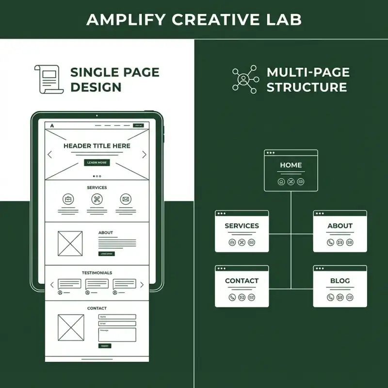
Homepage vs Landing Page: When to Use Each
Before diving into the framework, it’s worth being clear about what a landing page actually is — because the term gets thrown around loosely.
Your Homepage Is a Lobby
Think of your homepage as a building lobby. It welcomes different types of visitors and directs them to different floors. It needs navigation, brand context, a service overview, trust signals, and multiple pathways. That’s fine for organic visitors who arrive through a branded search or a direct URL. They’re exploring. They want options.
A Landing Page Is a Meeting Room
A landing page is a single room with one purpose. The visitor arrives knowing roughly what they want (your ad told them), and the page’s only job is to deliver on that promise and capture the lead. No navigation menu. No sidebar. No “check out our blog” links. One goal, one action.
When to Use Which
- Use your homepage for branded search, direct traffic, PR mentions, and visitors in early research mode.
- Use a landing page for Google Ads, Facebook/Instagram ad campaigns, email campaign CTAs, QR codes on printed material, and any traffic source where the visitor has already been primed with a specific message.
The distinction matters financially. If you’re paying $4 to $12 per click on Google Ads in Perth (common for service-based keywords), sending those clicks to a page that converts at 2 percent instead of 8 percent means you’re paying four times more per lead than you need to. For a Perth business spending $2,000 a month on ads, that’s the difference between 16 leads and 64 leads — from the same budget.
The Six-Section Landing Page Framework
This framework works across industries — we’ve used variations of it for tradies, professional services, hospitality venues, and ecommerce brands across Perth. Each section has a specific psychological job, and the sequence matters.
Section 1: Hero With Message Match
The hero section is the first thing visitors see, and it needs to accomplish one thing above all else: confirm that they’re in the right place. This is where message match becomes critical.
Message match means your landing page headline mirrors the language of the ad that sent the visitor there. If your Google Ad says “Same-Day Plumber in Perth CBD,” your landing page headline should say something very close to that — not “Welcome to Smith Plumbing, Your Trusted Partner Since 1987.”
Your hero section needs four elements:
- Headline: Matches the ad copy and includes your primary keyword. Keep it under 12 words.
- Subheadline: Expands on the promise with a specific benefit or differentiator. One to two sentences.
- Primary CTA button: Clear, action-oriented copy — “Get a Free Quote” beats “Submit” every time.
- Hero image or background: Relevant, professional imagery that reinforces the offer. Professional photography consistently outperforms stock images here.
Section 2: Problem-Agitation
Once you’ve confirmed the visitor is in the right place, your next job is to articulate the problem they’re experiencing — better than they could describe it themselves. This builds empathy and urgency.
For a Perth accounting firm targeting small business owners, this might look like: “You didn’t start your business to spend weekends buried in BAS statements. But every quarter, the same stress cycle hits — chasing receipts, second-guessing deductions, wondering if you’re leaving money on the table.”
Keep this section short — three to five sentences. You’re not dwelling on pain; you’re demonstrating that you understand their situation before presenting yourself as the solution.
Section 3: Solution With Benefits
Now you introduce your solution. The key here is leading with benefits, not features. Perth business owners don’t care that your software has “cloud-based infrastructure” — they care that they can check their accounts from their phone at the beach in Scarborough.
Structure this section as three to five benefit blocks, each with:
- A benefit-driven heading: What the customer gets, not what you do.
- A short description: Two to three sentences expanding on how this benefit works.
- An icon or small image: Visual anchors help visitors scan quickly.
If your service involves a visual component — photography, design, physical products — this is where strong imagery earns its keep. Visitors process images faster than text, and showing your work builds credibility faster than describing it.
Section 4: Social Proof and Trust
Social proof is the section that moves visitors from “this sounds good” to “I believe them.” For Perth businesses, local proof is especially powerful because the market is tight-knit. People want to know you’ve worked with businesses like theirs, in suburbs they recognise.
Effective social proof elements include:
- Client testimonials: Two to three short quotes with names, business names, and suburbs. “Sarah M., Subiaco” is more credible than “S.M.”
- Star ratings or review counts: “4.9 stars from 127 Google reviews” is a strong trust signal.
- Client logos: If you work with recognisable Perth brands, show their logos. Even four or five logos create a sense of established credibility.
- Case study snippets: A brief before-and-after stat — “Reduced cost-per-lead by 63% for a Joondalup trade business” — is more convincing than generic praise.
If you’re building trust signals for a broader web presence, our guide to ethical review generation covers strategies that apply well beyond hospitality.
Section 5: The Offer and CTA
This is where you make the ask explicit. By this point, visitors who’ve scrolled this far are warm — they understand their problem, they see your solution, and they trust your proof. Now remove any remaining ambiguity about what happens next.
Your offer section should include:
- A clear statement of the offer: “Book a free 30-minute strategy call” or “Get your custom quote in 24 hours.”
- What they’ll receive: Be specific. “You’ll get a personalised action plan covering X, Y, and Z” removes uncertainty.
- The form or CTA button: Placed directly within this section so visitors don’t have to scroll to find it.
- A risk reducer: “No obligation,” “Cancel anytime,” or “100% confidential” lowers the psychological cost of submitting.
Repeat your primary CTA button at least twice on the page — once in the hero and once in this section. For longer pages, a third CTA between the benefits and social proof sections is often worthwhile.
Section 6: FAQ or Objection Handling
The final content section handles the objections that stop warm visitors from converting. These are the “yes, but…” questions rattling around in their heads. Common ones include:
- “How much does it cost?” — Give a range or starting price. Vagueness breeds suspicion.
- ”How long does it take?” — Set clear expectations on timelines.
- ”What if it doesn’t work?” — Explain your guarantee, refund policy, or revision process.
- ”Are you actually local?” — Mention your Perth base, studio location, or service areas.
An FAQ section also has SEO benefits if you decide to index the page — it naturally targets long-tail question queries. For more on structuring FAQ content effectively, take a look at how we approach schema markup for FAQ sections.
Form Friction Reduction: The Details That Double Conversions
Your landing page form is where conversions either happen or die. Most Perth businesses over-engineer their forms because they want “qualified” leads — but asking for too much information upfront pushes people away before you get the chance to qualify them.
How Many Fields Should Your Form Have?
The short answer: as few as possible. Research consistently shows that reducing form fields increases submissions. Here’s a practical guide:
- Minimum viable form (highest conversion): Name + email or name + phone. Two fields.
- Balanced form: Name + email + phone + one qualifying question (dropdown). Four fields.
- Detailed form (lower conversion, higher lead quality): Name + email + phone + service type + budget range + brief message. Six fields.
For most Perth service businesses, we recommend starting with the balanced four-field approach. You get enough information to follow up meaningfully without scaring off visitors who are still early in their decision process.
Practical Form Optimisation Tips
- Use dropdowns instead of open text fields where possible — they’re faster to complete and give you cleaner data.
- Label fields clearly outside the input — placeholder text that disappears when you click creates confusion, especially on mobile.
- Make the submit button copy specific: “Get My Free Quote” converts better than “Submit” because it reminds visitors what they’re getting.
- Add a privacy statement near the submit button: “We’ll never share your details” reduces hesitation.
- Enable autofill — properly named form fields let browsers auto-populate name, email, and phone, cutting completion time dramatically on mobile devices.
- Test multi-step forms for complex services: breaking a six-field form into two steps of three fields each often lifts completions by 15 to 25 percent because the first step feels effortless.
If your landing pages are part of a broader website that also needs speed and usability work, our website development services cover performance optimisation alongside conversion-focused design.
Testing and Optimisation: The Ongoing Advantage
Launching a landing page isn’t the finish line — it’s the starting point. The businesses that consistently get the lowest cost-per-lead in Perth are the ones that treat their landing pages as living assets, not static brochures.
What to Test First
Not all tests are equal. Focus on high-impact elements in this order:
- Headline: This is the first thing visitors read and the biggest influence on whether they stay or bounce. Test different angles — benefit-led vs. problem-led, specific vs. broad.
- CTA button copy and colour: “Get a Free Quote” vs. “Request My Quote” vs. “See Pricing” can produce surprisingly different results. Button colour should contrast with the page background.
- Form length: Test three fields against five fields. The winner depends on your audience and offer.
- Social proof placement: Try moving testimonials above the fold vs. below the benefits section.
- Hero image: A photo of your team or studio vs. an image of the end result can shift conversions meaningfully.
A Simple Testing Framework
You don’t need enterprise-level tools to run effective tests. Here’s a practical framework for Perth small businesses:
- Week 1-2: Launch the page and gather baseline data. You need at least 100 visitors before making any changes.
- Week 3-4: Run your first A/B test on the headline. Split traffic evenly between two variations.
- Week 5-6: Keep the winning headline and test the CTA button copy or form length.
- Monthly: Review heatmaps and scroll depth data to identify where visitors drop off, then address those sections.
Even modest improvements compound significantly. Lifting conversion rate from 5 percent to 7 percent on a $2,000 monthly ad spend doesn’t sound dramatic — but over 12 months, that’s roughly 48 additional leads from the same budget. For many Perth businesses, those extra leads represent tens of thousands of dollars in revenue.
For tradies and quote-based businesses, the same principles apply to your entire quote funnel — our guide on tradie website design and quote funnels digs deeper into conversion paths specific to trade services.
Ready to Turn Your Ad Spend Into Actual Leads?
At Amplify Creative Lab, we design landing pages for Perth businesses that are built around one thing: converting the traffic you’re already paying for. Every page we build follows conversion-tested frameworks, includes mobile-first form design, and integrates with your CRM or email platform so leads flow straight into your pipeline.
If you’re running paid campaigns and suspect your pages are leaking leads, we can audit your current setup and show you exactly where the drop-off is happening.
Get in touch to discuss a landing page build or conversion audit for your next campaign.
See our website development services or explore our dedicated landing page design service for Perth businesses.