Why Infographics Still Matter in 2026
In a content landscape dominated by short-form video and AI-generated text, infographics remain one of the most effective formats for communicating complex information. Research consistently shows that visual content is processed 60,000 times faster than text, and infographics are shared on social media three times more than any other content type.
For Perth businesses in data-rich industries — real estate, finance, health and wellness, construction, technology — infographics transform dry statistics and complex processes into engaging, shareable assets. A well-designed infographic does what a 2,000-word report cannot: it communicates the key insight in seconds and makes the viewer want to share it.
The Anatomy of an Effective Infographic
The Narrative Structure
Every effective infographic follows a storytelling structure, not just a data display structure. The difference is crucial. A data display shows numbers. A data story provides context, builds understanding, and delivers a takeaway. Your infographic should follow this arc:
- Hook: A compelling headline and opening statistic that establishes why the viewer should care.
- Context: Background information that frames the data — the industry landscape, the problem, or the trend.
- Evidence: The core data points, visualised clearly and arranged in a logical sequence.
- Insight: The “so what” — what the data means and why it matters to the viewer.
- Takeaway: A clear conclusion or call to action that gives the viewer something to do with the information.
Visual Hierarchy and Flow
The design must guide the eye through the narrative in the correct order. This is achieved through size contrast (larger elements read first), colour emphasis (highlighted data points draw attention), spatial arrangement (top-to-bottom or left-to-right flow), and typographic hierarchy (headings, subheadings, body text, and captions at distinct sizes).
A common mistake is treating every data point with equal visual weight. When everything is emphasised, nothing is. Choose two or three hero statistics that carry the central message and make them visually dominant. Supporting data should be present but secondary.
Data Visualisation Best Practices
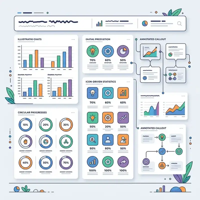
Choosing the right chart type is fundamental to clear communication:
- Bar charts: Best for comparing quantities across categories. Use horizontal bars when category labels are long.
- Line graphs: Ideal for showing trends over time. Keep to three lines maximum to maintain readability.
- Pie and donut charts: Use only for showing parts of a whole, and limit to five segments maximum. Beyond that, switch to a bar chart.
- Icon arrays: Effective for showing proportions in a more engaging way than pie charts — for example, 7 out of 10 icons highlighted.
- Process flows: Best for step-by-step sequences, decision trees, and timelines.
- Maps: Essential when geographic distribution is part of the story — particularly useful for Perth businesses presenting local market data.
Infographics as SEO Assets
Earning Backlinks
Infographics are among the most link-worthy content formats because they provide value that is difficult to replicate in text. When your infographic presents original data, a unique perspective on industry statistics, or a genuinely useful visual reference, other websites link to it as a resource. For Perth businesses looking to build domain authority, a well-promoted infographic can generate more backlinks than months of standard blog content.
Supporting Blog Content
The most effective SEO strategy for infographics is embedding them within supporting blog posts. The blog post provides the keyword-rich text content that search engines index, while the infographic increases time-on-page, reduces bounce rate, and encourages social sharing. This combination gives you the best of both worlds — search visibility and engagement.
Our post on the ROI of professional digital design demonstrates this principle — complex data about design’s impact on conversion rates becomes far more accessible when visualised alongside explanatory text.
Social Media Amplification
A single infographic can fuel weeks of social content. Break it into individual data points formatted as standalone social graphics. Create carousel posts that walk through the narrative section by section. Pull the most striking statistic for a text-overlay post. This multiplication approach means your design investment generates far more than a single content piece.
The Design Process for Perth Businesses
Research and Data Collection
Before any design work begins, the data must be solid. Identify your primary data sources, verify accuracy, and determine which data points best support your narrative. For Perth-specific infographics — local market statistics, WA industry data, regional comparisons — source data from the ABS, industry associations, and your own business analytics.
Original data is the most valuable. If your business can survey customers, analyse internal metrics, or compile industry benchmarks, the resulting infographic will be uniquely yours — impossible to replicate and highly link-worthy.
Wireframing and Structure
Before visual design begins, wireframe the infographic’s structure. Map out the narrative flow, allocate space for each section, and determine which data visualisation type each data point requires. This step prevents the common problem of running out of space for important content or cramming data into an awkward layout.
Visual Design and Brand Integration
Your infographic should feel unmistakably like your brand. Use your brand colour palette, typography, and graphic style throughout. This is not just about aesthetics — when your infographic is shared and reshared across the internet, every viewer sees your brand identity. Consistent brand application across infographics and all other visual content reinforces recognition. Our guide on brand consistency across channels explains how to maintain this cohesion systematically.
Optimisation and Output
Export infographics in multiple formats for different use cases:
- Full-resolution PNG or WebP: For embedding in blog posts and website pages.
- Compressed web version: Under 500 KB for fast page loading without sacrificing readability.
- PDF version: For downloadable resources, email attachments, and print.
- Social-formatted sections: Individual data points sized for Instagram (1080 x 1080), LinkedIn (1200 x 627), and Stories (1080 x 1920).
Common Infographic Mistakes to Avoid
After designing dozens of infographics for Perth businesses across industries, these are the mistakes we see most often:
- Too much data, too little story: An infographic with 30 data points and no narrative is a decorated spreadsheet. Edit ruthlessly — if a data point does not support the central message, cut it.
- Misleading visualisations: Truncated axes, inconsistent scales, and 3D chart effects distort data and undermine credibility. Always start bar chart axes at zero and use consistent proportions.
- Ignoring mobile viewing: Many viewers will see your infographic on a phone screen. If text is illegible at mobile width, the design fails for the majority of your audience.
- No source attribution: Always cite your data sources. This builds credibility and makes the infographic more trustworthy for journalists and bloggers considering a link.
- Missing branding: An infographic without your logo, brand colours, or website URL is a missed opportunity. Every share should trace back to your business.
Commission an Infographic
At Amplify Creative Lab, we design infographics that turn complex data into compelling visual stories for Perth businesses. From data research and narrative structuring to final design and multi-format delivery, our digital design services cover every step of the process.
Get in touch to discuss an infographic project — whether it is a one-off data visualisation or an ongoing content strategy built around visual assets.
Explore our full graphic design services or read about the ROI of professional digital design to understand how visual content investments drive measurable business results.