Why healthcare websites need a different standard
Healthcare visitors do not behave like retail shoppers. They are often comparing providers under time pressure, looking for reassurance, or trying to solve a stressful problem quickly. That changes what the website has to do.
It needs to build trust, reduce ambiguity, and make the next step obvious. That is why effective web design in Perth looks different in healthcare than it does in hospitality or ecommerce.
Trust starts with clarity
Patients should not need to work hard to answer basic questions:
- What do you treat?
- Who is the practitioner?
- Where is the clinic?
- How do I book?
- What happens next?
If those answers are buried under vague headings or generic stock visuals, the site feels less credible immediately. This is where interface clarity matters just as much as brand polish, and why the difference between UI and UX matters so much in healthcare.
The core UX priorities for clinics
1. Fast path to the right service
Many clinic websites present a long wall of information before helping users find the correct treatment or practitioner. A better approach is to surface a small set of clear pathways based on intent.
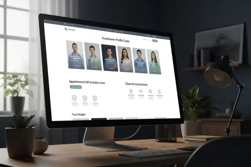
2. Practitioner proof
Healthcare is personal. Patients want to know who they will meet, not just what the clinic claims. Profiles, treatment experience, approach, and tone all help reduce uncertainty.
3. Booking without confusion
If bookings happen online, make the route obvious. If the clinic prefers calls or referrals, make that just as visible. The mistake is forcing every patient into the same interaction model.
4. Calm, readable accessibility
Good accessibility is not only about compliance. It is about making the site usable for real patients. That usually means:
- strong contrast
- readable typography
- predictable spacing
- clearly labelled buttons
- forms that are easy to complete on mobile
What high-converting healthcare pages usually include
A strong clinic website usually has:
- a clear hero statement about who the clinic helps
- visible location and booking actions
- practitioner proof close to the top of the page
- treatment pages written in plain language
- FAQs that answer common pre-booking concerns
- reassurance about what happens before, during, and after the appointment
When these elements are missing, the site often feels clinical in the wrong way: technically correct, but emotionally unhelpful. Teams planning multi-service healthcare sites usually also benefit from the reusable structure outlined in our design systems guide, especially when multiple practitioners, treatments, and location pages need to stay consistent.
Final take
Healthcare web design is really about reducing uncertainty. Patients need to understand the service, trust the people behind it, and act without friction.
If your clinic site feels vague, hard to scan, or difficult to book through, a more structured combination of web design and UX/UI planning usually produces stronger patient conversion than a purely visual refresh.