Why good-looking stores still underperform
Perth businesses often assume that launching on Shopify is enough. It is not. Shopify gives you solid infrastructure, but it does not automatically give you a convincing storefront, a clean buying journey, or product pages that reduce hesitation.
A store that converts has to answer four questions quickly:
- What do you sell?
- Why should I trust you?
- How do I compare options?
- How do I buy without friction?
That is why ecommerce web design in Perth is really about UX sequencing, not just theme setup. If your navigation is vague, your collections are overcrowded, or your product pages hide critical details, shoppers leave before your checkout has a chance to work.
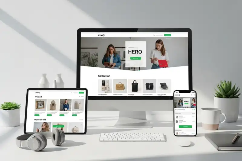
The four screens that matter most
1. Homepage: clarify the store promise
Your homepage should orient first-time visitors fast. Lead with category entry points, best sellers, offer clarity, and proof that you are a legitimate local brand. For most stores, that means reducing generic banner sliders and replacing them with:
- a clear value proposition
- one or two featured collection pathways
- shipping, returns, or local fulfilment reassurance
- recent proof such as reviews or customer count
If you need a broader platform and structural reset, our guide to ecommerce store design strategy covers the bigger planning decisions around platform fit, brand positioning, photography, and launch priorities.
2. Collection pages: make browsing feel easy
Collection pages are not just shelves. They are comparison environments. Shoppers need filters, consistent thumbnail ratios, obvious pricing, and enough product information to decide whether to click deeper. When collections are messy, customers feel like the catalogue is hard work.
Strong collection-page UX usually includes:
- meaningful category labels
- filters that match how customers shop
- visible review stars or trust indicators where appropriate
- product cards that do not force shoppers to click just to learn basics
3. Product pages: remove hesitation before it becomes abandonment
Most stores lose more revenue on product pages than at checkout. This is where shoppers decide whether your offer feels credible, useful, and worth the price. The exact layout patterns that help here are covered in our product page UX guide for Perth ecommerce brands, but the fundamentals stay consistent:
- show the product clearly
- answer the biggest objections early
- explain shipping and returns without hiding them
- surface bundle or upsell logic only after the core choice feels safe
4. Cart and checkout: keep momentum intact
By the time someone reaches the cart, your job is to avoid introducing doubt. Hidden shipping, aggressive upsells, and unnecessary form fields destroy momentum. A good checkout feels short, predictable, and trustworthy.
The UX patterns that usually lift conversion
Clear navigation architecture
Shoppers rarely browse like you expect. They do not care how you organise stock internally. They care about finding the right item quickly. That means navigation should reflect customer intent, not internal admin categories.
Local trust signals
Perth shoppers still look for legitimacy cues, especially when buying from a newer brand. Surface local shipping details, policy clarity, review proof, and visible contact options before the cart.
Mobile-first product browsing
Many store audits fail on mobile because filters are clumsy, image galleries are awkward, or sticky add-to-cart behaviour is missing. A strong mobile store should let a customer browse, compare, and commit with one hand.
Photography with purpose
Design and photography work together. Collection pages need consistency. Product pages need image hierarchy. Bundles and upsells need context. If the imagery is weak, the store has to work much harder to convince. That is why many builds combine storefront UX with product imagery planning from day one.
A better Shopify launch checklist
Before launch, make sure your store has:
- collection naming that makes sense to first-time shoppers
- search and filters tested on mobile
- product pages with shipping, returns, and trust details visible
- cross-sell logic that supports the basket instead of distracting from it
- email capture placed where it helps rather than interrupts
- analytics and conversion tracking connected to the actual funnel
- redirects ready if this is a redesign or migration
Final take
The goal is not to launch the prettiest Shopify store in Perth. The goal is to launch a store that helps shoppers make confident decisions with minimal friction. If your store structure is doing that, conversion improves. If it is not, more traffic will only amplify the problem.
If you want to plan a faster, higher-converting storefront, start with our ecommerce web design service and review your product pages against the UX patterns that lift AOV before committing to a rebuild.
If the store now needs a deeper architecture discussion around integrations, platform fit, or rollout risk, compare it with our ecommerce development service. If the storefront is moving toward richer interface behaviour, review web app development as well.