Restaurant menus are still one of the most common friction points on hospitality websites. The venue may have strong photography, a decent booking engine, and good reviews, but if the menu is hidden inside a clumsy PDF or built without mobile behaviour in mind, customers lose momentum fast.
This guide combines the mobile-first menu-design article with the PDF-versus-digital SEO case into one practical framework. The goal is simple: help restaurants move from static menu files to digital menus that are easier to browse, easier to update, and better at supporting both search visibility and conversion.
Why restaurant menu design matters more than most venues think
A menu is not just supporting content. For many restaurant websites, it is one of the main decision pages. Customers often want only a few answers:
- What kind of food is this?
- Does the pricing fit?
- Are there dietary options?
- Can I book or order now?
If the menu page is slow, cramped, hard to scan, or detached from the rest of the website flow, the venue starts losing intent at the exact point customers are trying to decide.
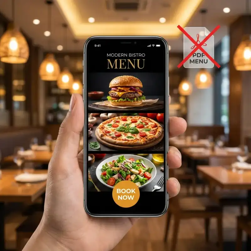
The core problem with PDF menus
PDF menus seem convenient because they are easy to export and upload. But on a live restaurant website they create several problems at once:
- they interrupt mobile browsing with downloads, zooming, and awkward scrolling
- they reduce usability for people trying to scan categories or dietary options quickly
- they weaken measurement because a download tells you much less than real on-page behaviour
- they separate the menu from conversion actions like booking, enquiry, or ordering
- they usually underperform in search compared with proper HTML menu content
Even when Google can technically read parts of a PDF, it is still a weak format for a page customers need to use actively. The restaurant loses twice: weaker UX and weaker discoverability.
What a proper digital menu looks like
For most restaurants, a digital menu means an HTML menu built directly into the site. That does not mean it needs to feel plain. It means the menu behaves like a real website component instead of a detached document.
A strong digital menu usually includes:
- clear category structure such as starters, mains, desserts, drinks, and specials
- readable mobile layout with comfortable text size and touch spacing
- fast-loading imagery where photography helps rather than slows the page
- dietary markers that are visible and easy to understand
- direct next steps such as book, order, or enquire
- simple update workflows so price and item changes do not become a publishing bottleneck
Why HTML menus outperform PDFs for mobile UX
Most restaurant traffic arrives from phones. That alone is enough reason to design the menu for the small screen first.
Mobile-first menu design means:
- content priority: dish names, prices, and dietary signals appear first
- thumb-friendly interaction: sections expand cleanly and controls are easy to tap
- progressive disclosure: secondary details can sit behind accordions or shorter descriptions when needed
- speed-first media handling: photos are compressed and loaded carefully
- reduced friction: customers can move from browsing to booking without leaving the page flow
That is why digital menu design is not just a content formatting choice. It is a conversion design problem.
Why HTML menus outperform PDFs for SEO
The SEO case is not only about indexing. It is about giving search engines and users a better page to work with.
| Area | PDF menu | HTML digital menu |
|---|---|---|
| Mobile experience | Weak, download-heavy, zoom-dependent | Fast, responsive, and easier to browse |
| Search visibility | Limited and inconsistent | Stronger on-page content and internal-link value |
| Analytics | Mostly download events | Real page behaviour, clicks, and engagement signals |
| Conversion path | Disconnected from booking or ordering | Can sit directly beside booking and ordering actions |
| Updates | Slow and document-dependent | Faster and easier to maintain in the site |
| Accessibility | Often poor | Can be built properly for assistive tech and readable structure |
In practice, HTML menus give the website more usable content depth, stronger internal navigation, and better mobile behaviour. Those factors usually matter more than whether Google can extract a few words from a PDF file.
What restaurant digital menus should optimise for
1. Fast decisions
Customers should be able to understand the venue quickly. Menu sections, pricing logic, and hero dishes need to feel obvious rather than buried.
2. Booking or ordering momentum
The menu should not be isolated. It should support the next action with visible booking, ordering, or contact pathways.
3. Dietary clarity
Vegetarian, vegan, gluten-free, and allergy-related signals should be easy to scan. Friction here causes abandonment fast.
4. Visual appetite appeal
Strong imagery helps when used selectively. Pair this with professional food photography ROI if the venue needs better product imagery rather than more generic design changes.
5. Maintainability
If the venue cannot update prices, specials, or item availability quickly, the system will drift out of date and become unreliable.
A practical build checklist for restaurant digital menus
- Audit the current menu flow: test on mobile, measure load time, and check how quickly a diner can find prices and dietary info.
- Replace PDF-first delivery: move the core menu into the website as structured HTML content.
- Rework category structure: simplify sections so customers can scan without cognitive overload.
- Design for phones first: headings, spacing, accordions, and imagery should all be validated on small screens before desktop polish.
- Integrate real CTAs: pair the menu with booking, ordering, or enquiry actions in the same browsing flow.
- Optimise media and performance: compress imagery, avoid oversized files, and keep layout stable.
- Track behaviour after launch: monitor bounce, time on page, menu interaction, and booking-click patterns.
Common mistakes restaurants make when going digital
1. Recreating the PDF in HTML
If the site simply copies the same cramped structure into a web page, the result is still poor. Digital menu design needs a different reading model.
2. Adding too many images
Photography helps, but image-heavy menus can become slow and cluttered. Use visuals where they create clarity or appetite appeal, not everywhere by default.
3. Forgetting the booking path
The menu is often a decision page. If customers cannot move easily into a table booking or order flow, the design is underperforming.
4. Treating menu UX as separate from the wider site
If the rest of the site is slow or confusing, the menu alone cannot carry conversions. Use our restaurant website checklist to review the wider journey.
5. Not designing for updates
The system should survive seasonal changes, specials, and price adjustments without forcing a redesign every time.
When this becomes a wider redesign problem
Sometimes the menu is not the only issue. If the website also has weak booking UX, dated layout patterns, or broader speed problems, the menu rebuild should sit inside a wider redesign pass.
That is where articles like our Perth menu redesign case study and restaurant booking UX guidance help frame the bigger fix.
If the venue is still using the site like a brochure rather than a conversion asset, the right next step may be a broader website redesign rather than a standalone menu patch.
Final takeaway
Restaurants should stop asking whether a PDF menu is “good enough.” The better question is whether the menu helps customers decide, search engines understand the page, and staff can keep the content current without friction.
For most venues, the answer points in the same direction: move to an HTML menu, design it for mobile first, keep the structure clear, and connect it directly to booking or ordering actions. That is what digital menu design should do.
For a broader review of the full hospitality website journey, pair this with restaurant website checklist Perth, our Google Maps guide for Perth restaurants, and our Perth web design service.