Why Generic Icon Packs Fall Short for Software Products
Every SaaS product starts with a free icon pack. Font Awesome, Heroicons, Phosphor, Material Symbols — they are excellent resources for prototyping and MVPs. But as your product matures, the cracks begin to show. Icons from different sets have different stroke weights. Some are filled, others are outlined. The visual metaphors do not quite match your features. And your product ends up looking like every other SaaS tool on the market.
For Perth-based software companies competing nationally or globally, this visual inconsistency erodes the polish and professionalism that users expect. Custom iconography solves this by giving you a unified visual language — a set of icons designed specifically for your product, your brand, and your users.
Building the Icon Grid System
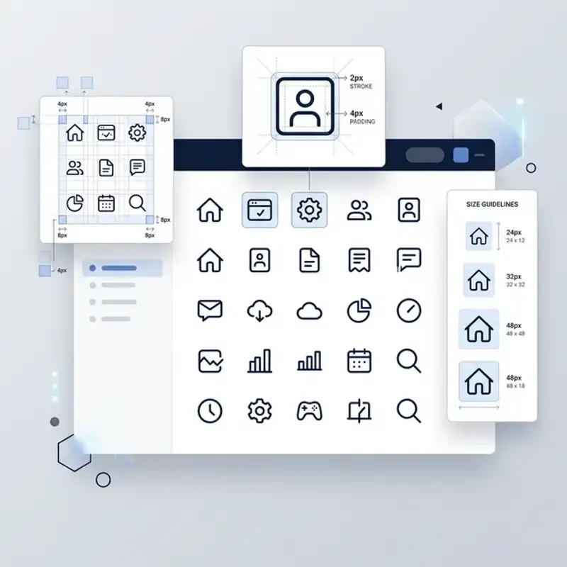
The Base Grid
Every custom icon set starts with a grid — a standardised canvas that ensures consistent sizing and alignment across all icons. The most common grid sizes are 24x24 pixels and 20x20 pixels, with a 1-2 pixel padding zone (sometimes called a “safe area”) around the edges.
The grid does more than define size. It establishes keyline shapes — circle, square, vertical rectangle, and horizontal rectangle — that icons are designed within. A home icon might fill a square keyline, while a pencil icon sits within a vertical rectangle. By aligning to these keylines, icons achieve optical consistency even though their individual shapes differ significantly.
Stroke Weight and Corner Radius
Two of the most impactful decisions in icon design are stroke weight and corner radius. These two properties define the personality of your entire icon set:
- 1.5px stroke weight — the current industry standard for UI icons, offering clarity at small sizes while remaining refined at larger scales
- 2px stroke weight — bolder and more assertive, often used by products targeting younger demographics or casual markets
- Rounded corners (2px radius) — creates a friendly, approachable feel common in consumer SaaS products
- Square corners (0px radius) — produces a precise, technical aesthetic suited to enterprise and B2B software
Whatever values you choose, document them rigorously and apply them to every single icon. Consistency here is what separates a professional icon system from a random collection of shapes.
Designing for Clarity and Recognition
Visual Metaphors
Each icon must communicate its meaning instantly. Users should not need to hover over an icon to understand what it does. This means using established visual metaphors where they exist (a magnifying glass for search, a gear for settings) and creating clear, intuitive metaphors for product-specific concepts.
For novel concepts, combine familiar elements. If your SaaS product has a “smart scheduling” feature, you might combine a calendar icon with a small lightning bolt to convey automation. Test these custom metaphors with real users — what seems obvious to your design team may confuse your audience.
Pixel-Perfect Alignment
Icons rendered at small sizes (16-24 pixels) are particularly sensitive to sub-pixel alignment. A stroke that falls between two pixels renders as a blurry line rather than a crisp edge. Designing icons on a pixel grid — snapping anchor points to whole-pixel coordinates — eliminates this problem and ensures razor-sharp rendering on all screens.
Optical Sizing
Not all shapes occupy visual space equally. A circle inside a 24x24 grid looks smaller than a square inside the same grid, even though they technically occupy the same canvas. Optical sizing compensates for this by slightly enlarging circular and triangular shapes to match the perceived weight of rectangular icons. This attention to detail is what makes a professionally designed web experience feel balanced and polished.
Accessibility Standards for Icon Design
Accessible icon design is not optional — it is a legal and ethical requirement, and it directly impacts your product’s usability for all users, not just those with disabilities.
Contrast Requirements
UI component graphics (including icons) must meet a minimum contrast ratio of 3:1 against their background, as defined by WCAG 2.1 AA standards. This means a light grey icon on a white background may look elegant but fails accessibility requirements. Test every icon in both light and dark modes using a contrast checker tool.
Text Labels and ARIA Attributes
Icons used as interactive elements — buttons, links, toggles — must include descriptive text labels or ARIA attributes for screen reader users. Best practices include:
- Visible text labels alongside icons — the most accessible approach, particularly for primary navigation items
- aria-label on icon-only buttons — provides screen reader context when visual space is limited
- title attributes on SVG elements — an additional layer of context, though aria-label takes precedence
- Decorative icons set to aria-hidden=“true” — prevents screen readers from announcing non-meaningful icons
Never Rely on Icons Alone
Critical actions — delete, submit, confirm — should never be communicated solely through an icon. A bin icon without a “Delete” label is ambiguous. Pair icons with text labels, especially for destructive or irreversible actions. This principle applies equally to status indicators: do not use colour alone (a red dot) to convey errors. Add an icon and text to ensure the message reaches all users.
Production Standards and Delivery
SVG Optimisation
For web and app deployment, SVGs are the standard format. But raw SVGs exported from design tools often contain unnecessary metadata, inline styles, and redundant groups. Run every icon through an SVG optimiser (SVGO is the industry standard) to strip unnecessary code, reducing file size by 30-60%.
Consistent Naming Conventions
Name icons descriptively and consistently. Use a pattern like icon-[category]-[name].svg — for example, icon-nav-home.svg, icon-action-delete.svg, icon-status-error.svg. This makes icons easy to find in codebases and design files, especially as the set grows beyond 50 icons.
Design Token Integration
Modern SaaS products use design tokens to manage colours, spacing, and sizing across platforms. Your icon system should integrate with these tokens — allowing icons to inherit colour from CSS custom properties rather than having hard-coded fill values. This makes theme switching (light mode to dark mode, for example) seamless.
Documentation
Deliver every icon set with documentation that covers:
- Grid system specifications — canvas size, safe area, keyline shapes
- Style rules — stroke weight, corner radius, cap style, join style
- Usage guidelines — when to use filled vs outlined variants, minimum sizes, and spacing rules
- Accessibility notes — required ARIA attributes and contrast requirements
- Extension instructions — how to add new icons that match the existing set
This documentation ensures your icon system remains consistent as your product and team grow — maintaining the brand consistency that makes software products feel trustworthy.
Icon Systems for Perth Tech Companies
Perth’s tech sector is growing rapidly, with SaaS companies emerging across mining technology, health tech, fintech, and logistics. For these businesses, product design quality is a competitive differentiator. A polished, consistent icon system signals maturity and reliability to users, investors, and enterprise clients alike.
Whether you are building your first MVP or redesigning an established platform, investing in custom iconography pays dividends in user comprehension, reduced support tickets, and stronger brand perception.
Request a UI Design Audit
At Amplify Creative Lab, we design custom icon systems for software products and SaaS platforms. From grid system design to accessible, production-ready SVG delivery, we build icon sets that scale with your product.
Get in touch to request a UI design audit for your software product.
See our graphic design services, explore our digital design capabilities, or learn about web development for Perth tech businesses.