Why Consistency Breaks First in Digital
The first place a growing brand usually becomes inconsistent is online. One social channel is handled by the owner, another by a staff member, and paid campaigns by a freelancer. The website may still reflect an older version of the brand, while email graphics use a completely different style again.
That fragmentation is rarely caused by bad intent. It usually comes from speed. Teams are publishing quickly, reacting to promotions, and using whatever format is easiest in the moment. The result is a customer seeing three versions of the same business in one week.
If your brand looks different on every platform, the audience starts doing extra work to understand whether all of those touchpoints belong to the same company. That friction weakens recall and trust.
The Difference Between Consistent and Repetitive
Consistency is not about forcing the same square tile everywhere. It is about repeating the same underlying visual rules:
- the same typography hierarchy
- the same colour logic
- the same image treatment
- the same logo handling
- the same tone of voice
- the same CTA style
Those rules can then flex by channel.
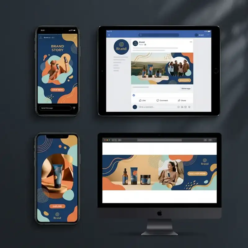
For example, an Instagram carousel might use bold overlay text and tighter crops, while LinkedIn graphics use more white space and clearer hierarchy for professional readers. Both can still feel like the same brand when the visual system underneath is stable.
The Five Layers of Digital Brand Consistency
1. Colour Rules
Do not just define brand colours. Define usage rules.
- Which colour is reserved for CTA buttons?
- Which colour is used for headline accents?
- Which tones are allowed as backgrounds?
- Which colours should never appear together?
When those rules are vague, every new graphic becomes a design decision from scratch. When they are clear, the team moves faster.
2. Typography Hierarchy
Consistency usually breaks when too many fonts or too many text treatments are introduced over time. Lock down:
- headline font
- body font
- one accent style
- preferred alignment patterns
- minimum and maximum text density by channel
If you already have a broader identity system, this should connect directly to it. Our guide on branding services in Perth explains how that broader system should be documented.
3. Layout Patterns
Most brands do not need infinite layout variation. They need six to twelve strong templates that cover recurring needs:
- quote cards
- offer or promo graphics
- educational carousels
- testimonial tiles
- event announcements
- product or service highlights
- reel or video cover frames
This is why template libraries matter. The goal is not to remove creativity. The goal is to remove unnecessary reinvention.
4. Image Treatment
Photography and illustration often create more inconsistency than logos do. Decide how images should behave:
- Are they high contrast or soft?
- Do they use colour overlays?
- Are crops tight or spacious?
- Are backgrounds neutral or environmental?
- Are icons filled, outlined, or mixed?
The answer should not depend on who happened to publish the post that day.
5. Voice and CTA Language
Visual consistency gets attention, but verbal consistency closes the loop. If one channel sounds playful, another sounds hyper-corporate, and a third sounds generic, the experience starts feeling stitched together.
Your CTAs should also follow repeatable patterns. A business that uses “Book a Call”, “Start Here”, “Get Started”, “Let’s Talk”, and “Request Pricing” interchangeably may be creating avoidable confusion.
Build a Channel Matrix Instead of One Generic Guideline
A practical way to manage consistency is to create a simple channel matrix. List every active channel and define:
- purpose of the channel
- audience mindset
- preferred content formats
- safe text density
- image ratio rules
- CTA style
- owner or approver
This keeps the brand aligned without pretending every channel behaves the same way.
The Minimum Asset Stack Every Small Team Needs
If your business is still small, do not overcomplicate this. The minimum useful stack is:
- one shared logo folder
- one approved colour palette
- one typography guide
- six to ten templates
- one folder of approved icons and illustrations
- one current brand guideline PDF
That stack is enough for most growing service businesses, retailers, and hospitality brands. It becomes even more useful when paired with a dedicated digital and social design service or a retainer structure.
Common Failure Points
Too Many Tools
When some files live in Canva, others in Figma, others on a staff member’s desktop, and others inside old email attachments, brand drift is inevitable. Pick one source of truth.
No Approval Rules
If anyone can publish anything without a quick review step, low-quality or off-brand visuals will eventually slip through. Even a light approval workflow makes a difference.
Channel-by-Channel Freelancers
Using different contractors for different channels can work, but only when there is a well-defined visual system. Without that, each contractor adds their own interpretation of the brand.
Campaign Urgency
Urgency is where consistency usually collapses. Limited offers, launches, and last-minute events pressure teams into bypassing the system. A template library solves most of this problem before it starts.
A Simple QA Checklist Before Publishing
Before any asset goes live, check:
- Does it use approved fonts and colours?
- Does the logo appear correctly, or is it better omitted?
- Does the image treatment match other current content?
- Is the CTA language aligned with the rest of the campaign?
- Would this still feel like the same brand if the logo were removed?
That fifth question is the most useful one. Strong brands stay recognisable even when the logo is not doing all the work.
Hire Our Digital Design Team
At Amplify Creative Lab, we help Perth businesses turn scattered digital visuals into a clear, repeatable design system. If your brand is drifting across social, ads, and email, we can build the templates, rules, and rollout process that tighten it back up.
See our digital and social design service or get in touch to discuss a lighter-weight support model for your business.
Need help turning this into a repeatable publishing system? Explore our content creation services or contact us to plan the rollout.